head(cars) speed dist
1 4 2
2 4 10
3 7 4
4 7 22
5 8 16
6 9 10There are lot’s of ways to make plots in R. These include so-called “base R” (like the plot()) and add on packages like ggplot2.
Let’s make the same plot with these two graphics systems. We can use the inbuilt cars dataset:
head(cars) speed dist
1 4 2
2 4 10
3 7 4
4 7 22
5 8 16
6 9 10With “base R” we can simply:
plot(cars)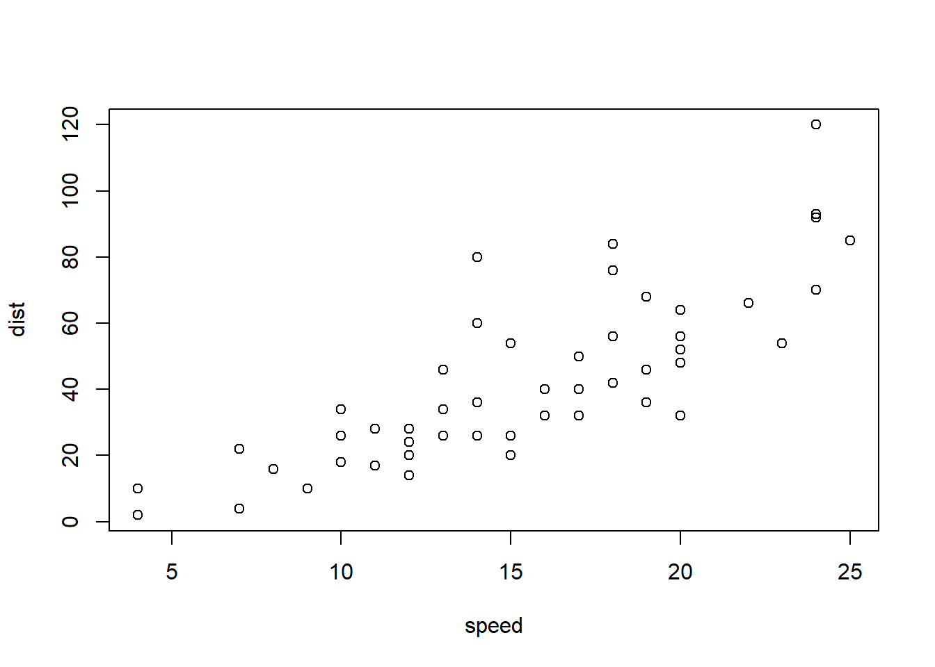
Now let’s try ggplot. First I need to install the package using install.packages("ggplot2").
N.B. We never run an
install.packages()in a code chunk otherwise we will re-install needlessly every time we render our document.
Everytime we want to use an add-on package we need to load it up with a call to library()
library(ggplot2)
ggplot(cars)
Every ggplot needs at least three things:
ggplot(cars) + aes(x=speed, y=dist) + geom_point() + geom_line() 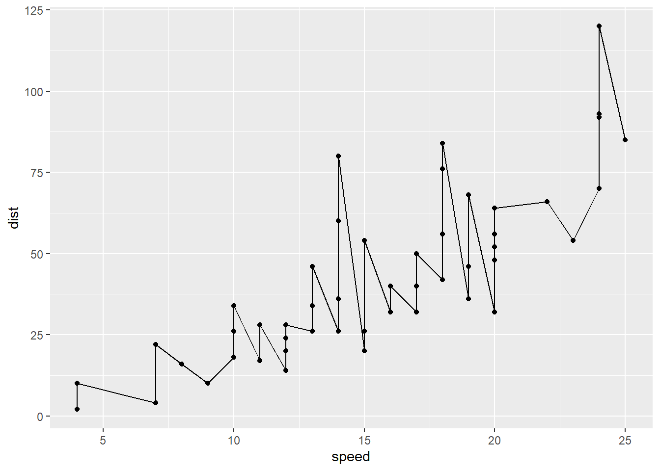
ggplot(cars) + aes(x=speed, y=dist) + geom_point() + geom_smooth() `geom_smooth()` using method = 'loess' and formula = 'y ~ x'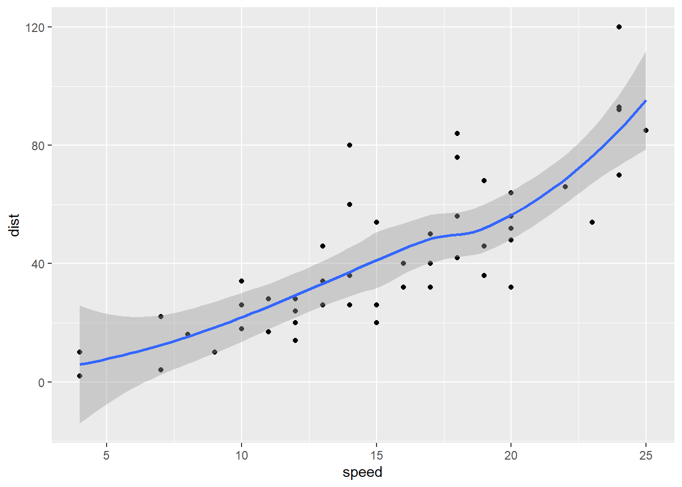
ggplot(cars) + aes(x=speed, y=dist) + geom_point() +
  geom_smooth(method = "lm", se = FALSE) +
  labs(x="Speed (MPH)",
       y = "Distance (ft)",
       title = "Stopping Distance of Old Cars") + theme_bw()
`geom_smooth()` using formula = 'y ~ x'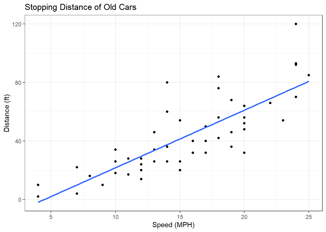
Read some data on the effects of GLP-1 inhibitor (drug) on gene expression values.
url <- "https://bioboot.github.io/bimm143_S20/class-material/up_down_expression.txt"
genes <- read.delim(url)
head(genes)
Gene Condition1 Condition2 State
1 A4GNT -3.6808610 -3.4401355 unchanging
2 AAAS 4.5479580 4.3864126 unchanging
3 AASDH 3.7190695 3.4787276 unchanging
4 AATF 5.0784720 5.0151916 unchanging
5 AATK 0.4711421 0.5598642 unchanging
6 AB015752.4 -3.6808610 -3.5921390 unchangingVersion 1 Plot - start simple by getting some ink on the page.
ggplot(genes) + aes(Condition1, Condition2) + geom_point(col="blue", alpha=0.2)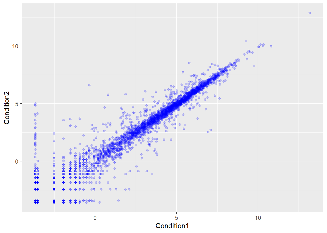
Let’s color by State up, down or no change.
table(genes$State)
      down unchanging         up
72 4997 127 ggplot(genes) + aes(Condition1, Condition2, col=State) + geom_point() + scale_color_manual(values = c("purple", "gray", "orange")) +
labs(x="Control (no drugs)",
y= "Drug",
title = "Expression Changes with GLP-1 Drug") + theme_bw()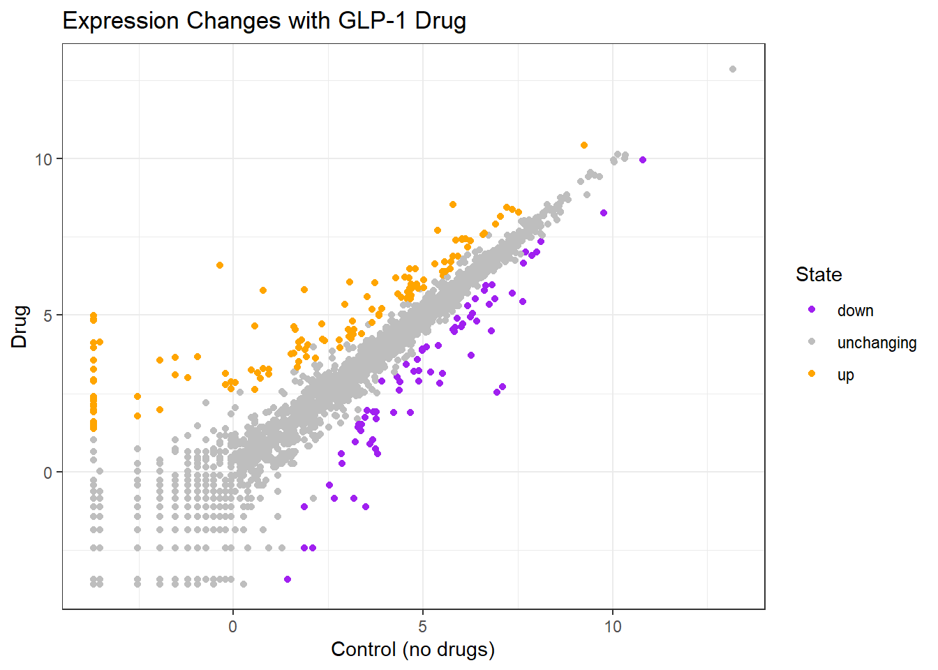
Here we explore the famous gapminder dataset with some custom plots.
url <- "https://raw.githubusercontent.com/jennybc/gapminder/master/inst/extdata/gapminder.tsv"
gapminder <- read.delim(url)
head(gapminder)
country continent year lifeExp pop gdpPercap
1 Afghanistan Asia 1952 28.801 8425333 779.4453
2 Afghanistan Asia 1957 30.332 9240934 820.8530
3 Afghanistan Asia 1962 31.997 10267083 853.1007
4 Afghanistan Asia 1967 34.020 11537966 836.1971
5 Afghanistan Asia 1972 36.088 13079460 739.9811
6 Afghanistan Asia 1977 38.438 14880372 786.1134Q. How many rows does this dataset have?
nrow(gapminder)[1] 1704Q. How many different continents are in this dataset ?
table(gapminder$continent)
  Africa Americas     Asia   Europe  Oceania
     624      300      396      360       24
Version 1 plot GDP vs LifeExp for all rows
ggplot(gapminder) + aes(gdpPercap, lifeExp, col=continent) + geom_point() +
labs(x="GDP per Capita", y="Life Expectancy") + theme_bw() 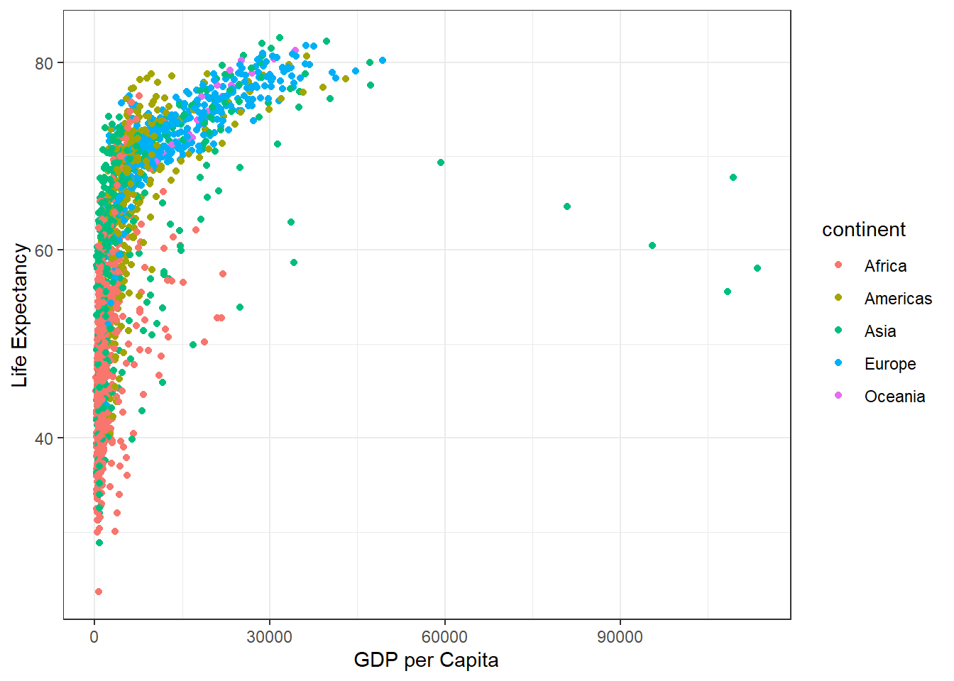
I want to see a plot for each continent - in ggplot lingo this is called “Faceting”
ggplot(gapminder) + aes(gdpPercap, lifeExp, col=continent) + geom_point() +
  labs(x="GDP per Capita", y="Life Expectancy") +
theme_bw() + facet_wrap(~continent) 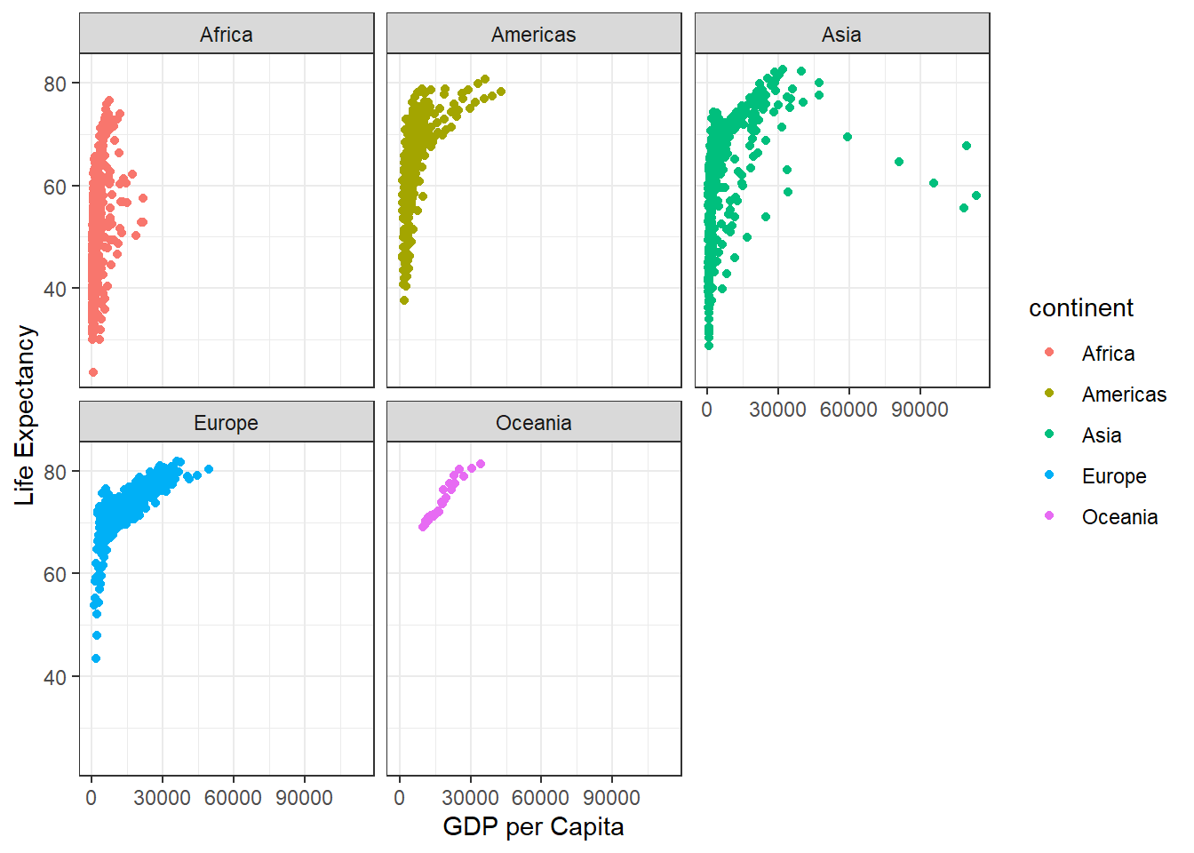
Another add-on package with a function called filter() that we want to use.
library(dplyr)
Attaching package: 'dplyr'The following objects are masked from 'package:stats':
filter, lagThe following objects are masked from 'package:base':
intersect, setdiff, setequal, unionfilter(gapminder, year == 2007, country == "Ireland") country continent year lifeExp pop gdpPercap
1 Ireland Europe 2007 78.885 4109086 40676filter(gapminder, year == 2007, country == "United States") country continent year lifeExp pop gdpPercap
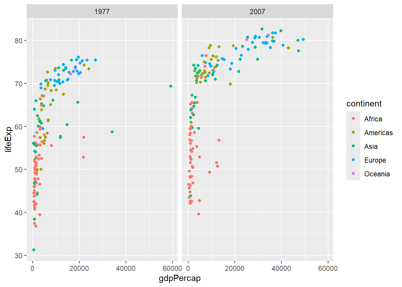
1 United States Americas 2007 78.242 301139947 42951.65input <- filter(gapminder, year == 2007 | year == 1977)
ggplot(input) + aes(gdpPercap, lifeExp, col=continent) +
geom_point() + facet_wrap(~year)