hist(rnorm(5000))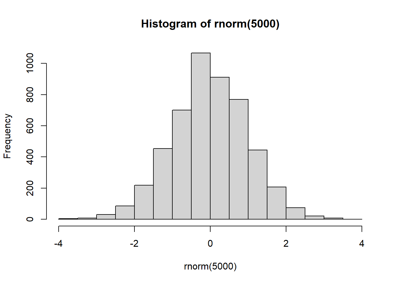
Today we will begin our exploration of some important machine learning methods, namely clustering and dimensionality reduction.
Let’s make up some input data for clustering where we known what the natural “clusters” are.
The function rnorm() can be useful here
hist(rnorm(5000))
Q. Generate 30 random numbers centered at +3 and another 30 centered at -3
temp <- c(rnorm(30, mean= 3),
          rnorm(30, mean= -3) )

x <- cbind(x=temp, y=rev(temp))
plot(x)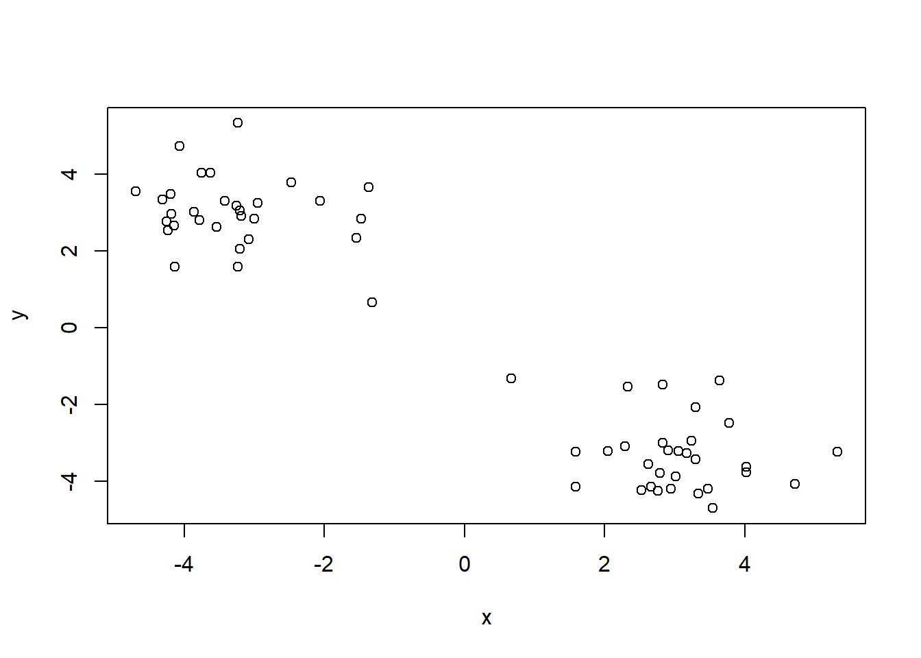
K = how many clusters you want from your data The main function in “base R” for Kmean clustering is called kmeans():
km <- kmeans(x, 2)
km
K-means clustering with 2 clusters of sizes 30, 30
Cluster means:
          x         y
1  3.012883 -3.290938
2 -3.290938  3.012883
Clustering vector:
 [1] 1 1 1 1 1 1 1 1 1 1 1 1 1 1 1 1 1 1 1 1 1 1 1 1 1 1 1 1 1 1 2 2 2 2 2 2 2 2
[39] 2 2 2 2 2 2 2 2 2 2 2 2 2 2 2 2 2 2 2 2 2 2
Within cluster sum of squares by cluster:
[1] 50.12444 50.12444
(between_SS / total_SS = 92.2 %)
Available components:
[1] "cluster" "centers" "totss" "withinss" "tot.withinss"
[6] "betweenss" "size" "iter" "ifault" Q. What component of the results object details the cluster sizes
km$size [1] 30 30Q. What component of the results object details the cluster centers (centroid)?
km$centers x y
1 3.012883 -3.290938
2 -3.290938 3.012883Q. What component of the results object details the cluster membership vector (i.e. our main result of which points lie in which cluster) ?
km$cluster [1] 1 1 1 1 1 1 1 1 1 1 1 1 1 1 1 1 1 1 1 1 1 1 1 1 1 1 1 1 1 1 2 2 2 2 2 2 2 2
[39] 2 2 2 2 2 2 2 2 2 2 2 2 2 2 2 2 2 2 2 2 2 2Q. Plot our clustering results with points colored by cluster and also add the cluster centers as new points colored blue
plot(x, col=km$cluster)
points(km$centers, col="blue", pch=15)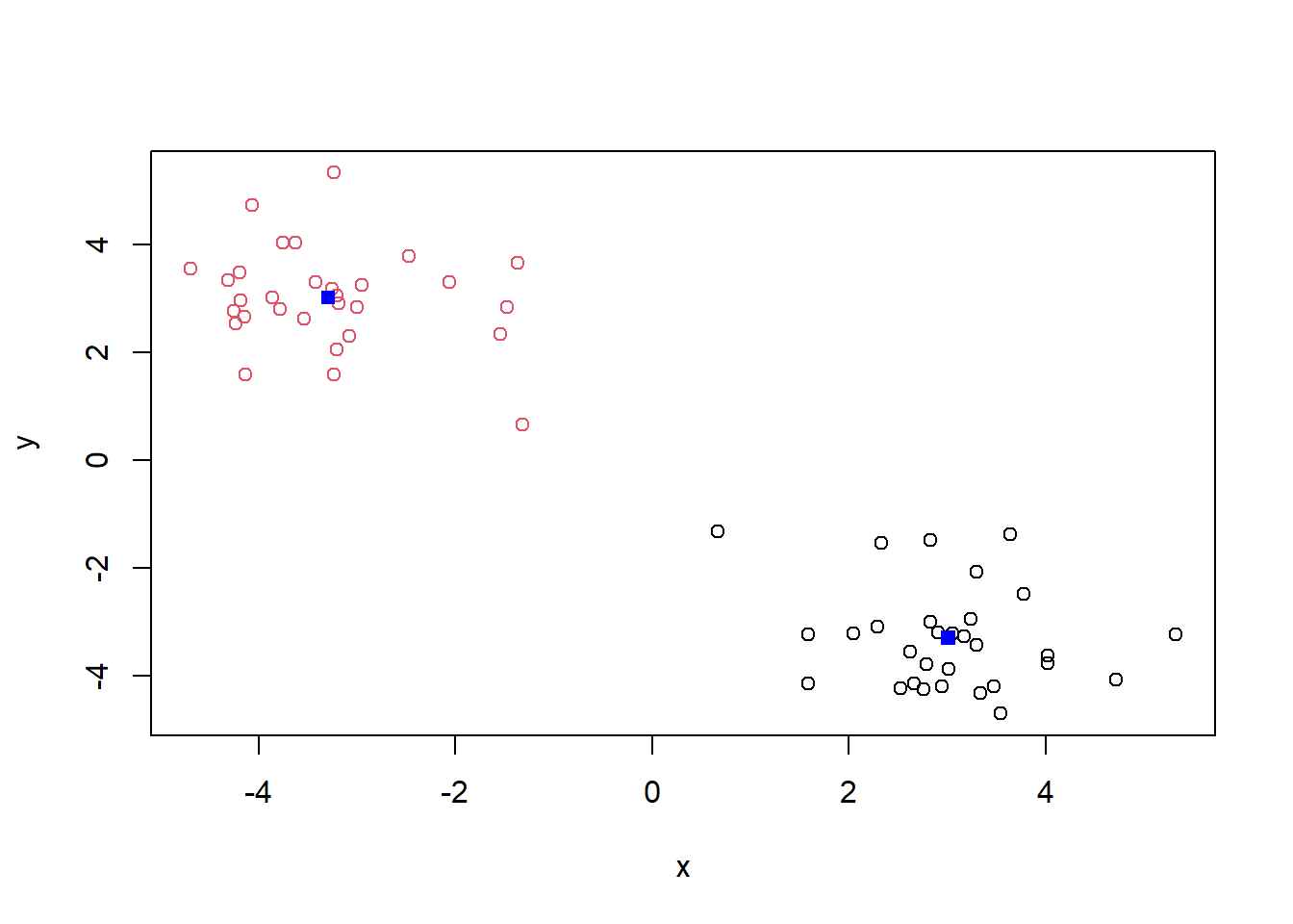
Q. Run
kmeans()again and this time produce four clusters (and call your result objectk4) and make a results figure like above
k4 <- kmeans(x, 4)
k4
K-means clustering with 4 clusters of sizes 30, 20, 5, 5
Cluster means:
x y
1 -3.290938 3.012883
2 2.786691 -3.691426
3 4.374561 -3.428790
4 2.555973 -1.551134
Clustering vector:
[1] 3 3 2 2 2 2 3 2 3 2 4 4 2 4 4 2 3 2 2 2 2 2 2 2 2 2 4 2 2 2 1 1 1 1 1 1 1 1
[39] 1 1 1 1 1 1 1 1 1 1 1 1 1 1 1 1 1 1 1 1 1 1
Within cluster sum of squares by cluster:
[1] 50.124444 11.434765 3.119017 5.795310
(between_SS / total_SS = 94.5 %)
Available components:
[1] "cluster" "centers" "totss" "withinss" "tot.withinss"
[6] "betweenss" "size" "iter" "ifault" plot(x, col=k4$cluster)
points(k4$centers, col="blue", pch=15)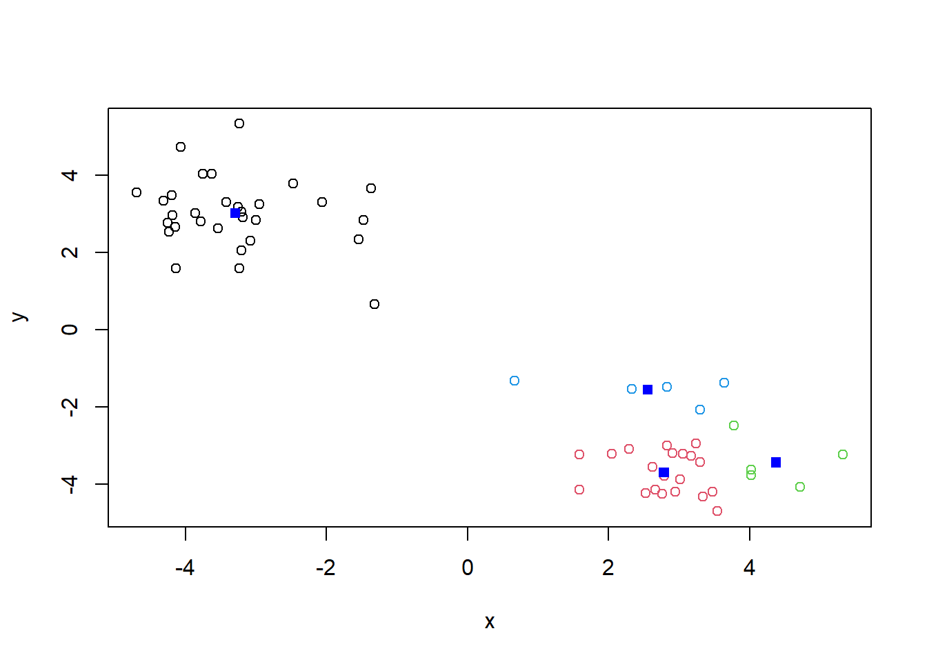
The metric
km$tot.withinss[1] 100.2489k4$tot.withinss[1] 70.47354Q. Let’s try different number of K (centers) from 1 to 30 and see what the best result is?
ans <- NULL
for(i in 1:30){
ans <- c(ans, kmeans(x, centers=i)$tot.withinss)
}

ans
[1] 1292.393720 100.248889 81.280868 70.408402 51.505516 40.698183
[7] 51.431149 29.240098 27.776059 24.174292 20.401976 17.350385
[13] 12.943534 11.833085 11.855896 10.053006 8.420604 7.404067
[19] 8.877156 6.866991 5.234590 6.466334 5.525326 4.481054
[25] 3.726045 3.757429 4.873616 3.144937 2.594034 3.648054plot(ans, typ="o")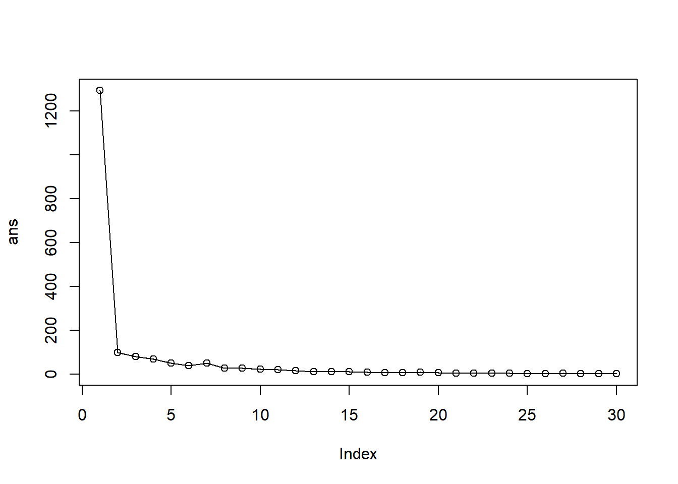
Key point: Kmeans will impose a clustering structure on data even if it isn’t there - it will always give an answer even if answer can’t be used
The main function for hierarchical clustering is called hclust(). Unlike kmeans() (which does all the work for you) you can’t just pass hclust() our raw input data. It needs a “distance matrix” like the one returned from the dist() function.
d <- dist(x)
hc <- hclust(d)
plot(hc)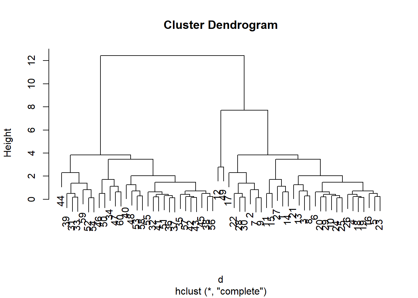
To extract our cluster membership vector from a hclust() result object, we have to “cut” our tree at a given height to yield separate “groups”/“branches”.
plot(hc)
abline(h=8, col="red", lty=2)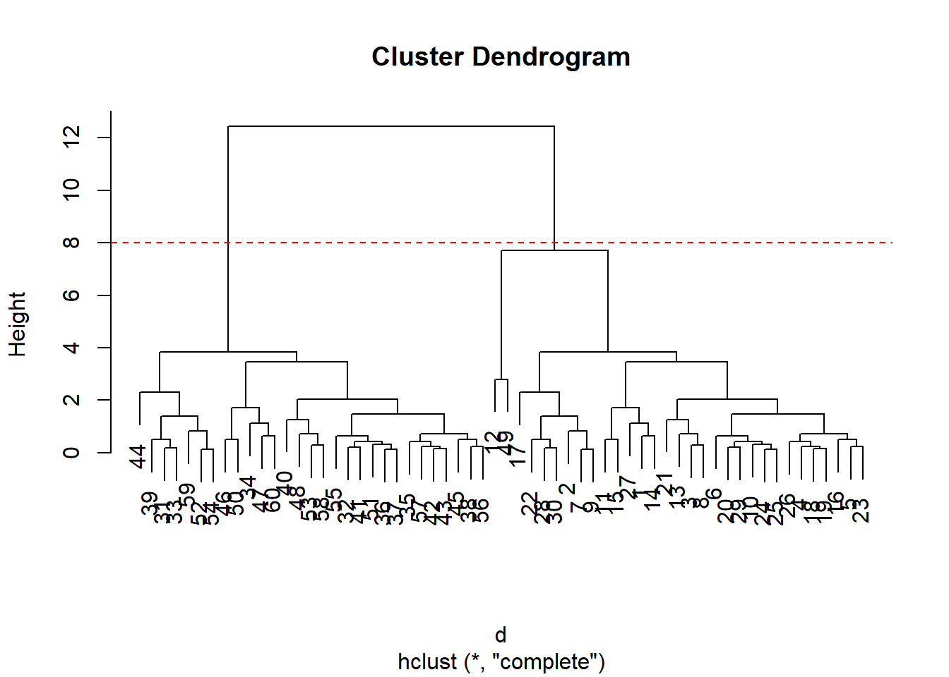
To do this, we use the cutree() function on our hclust() object:
grps <- cutree(hc, h=8)
grps
[1] 1 1 1 1 1 1 1 1 1 1 1 1 1 1 1 1 1 1 1 1 1 1 1 1 1 1 1 1 1 1 2 2 2 2 2 2 2 2
[39] 2 2 2 2 2 2 2 2 2 2 1 2 2 2 2 2 2 2 2 2 2 2table(grps, km$cluster)
grps  1  2
   1 30  1
2 0 29Import the data set on Food Consumption in the UK
url <- "https://tinyurl.com/UK-foods"
x <- read.csv(url)
x
X England Wales Scotland N.Ireland
1 Cheese 105 103 103 66
2 Carcass_meat 245 227 242 267
3 Other_meat 685 803 750 586
4 Fish 147 160 122 93
5 Fats_and_oils 193 235 184 209
6 Sugars 156 175 147 139
7 Fresh_potatoes 720 874 566 1033
8 Fresh_Veg 253 265 171 143
9 Other_Veg 488 570 418 355
10 Processed_potatoes 198 203 220 187
11 Processed_Veg 360 365 337 334
12 Fresh_fruit 1102 1137 957 674
13 Cereals 1472 1582 1462 1494
14 Beverages 57 73 53 47
15 Soft_drinks 1374 1256 1572 1506
16 Alcoholic_drinks 375 475 458 135
17 Confectionery 54 64 62 41Q1. How many rows and columns are in your new data frame named x? What R functions could you use to answer this questions?
dim(x)[1] 17 5One solution to set the row names is to do it by hand
rownames(x) <- x[,1]To remove the first column, we can use the minus index trick
x <- x[,-1]A problem with this is that it deletes a column every time the code is ran because the function is overriding itself.
A better way to do this is to set the row names to the first column with read.csv()
x <- read.csv(url, row.names=1)
x
England Wales Scotland N.Ireland
Cheese 105 103 103 66
Carcass_meat 245 227 242 267
Other_meat 685 803 750 586
Fish 147 160 122 93
Fats_and_oils 193 235 184 209
Sugars 156 175 147 139
Fresh_potatoes 720 874 566 1033
Fresh_Veg 253 265 171 143
Other_Veg 488 570 418 355
Processed_potatoes 198 203 220 187
Processed_Veg 360 365 337 334
Fresh_fruit 1102 1137 957 674
Cereals 1472 1582 1462 1494
Beverages 57 73 53 47
Soft_drinks 1374 1256 1572 1506
Alcoholic_drinks 375 475 458 135
Confectionery 54 64 62 41Q2. Which approach to solving the ‘row-names problem’ mentioned above do you prefer and why? Is one approach more robust than another under certain circumstances?
The second approach is more preferable because the code doesn’t override itself when it gets ran again.
It is difficult even in this 17D data set…
barplot(as.matrix(x), beside=T, col=rainbow(nrow(x)))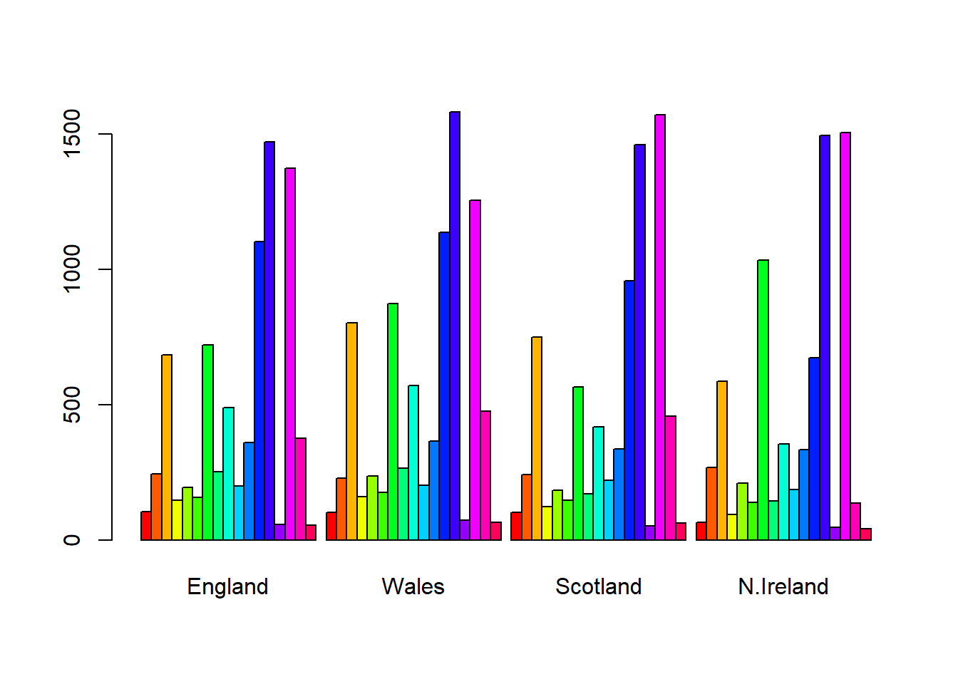
Q3: Changing what optional argument in the above barplot() function results in the following plot?
We would change beside=T to beside=F to go from a side by side to stacked plot
barplot(as.matrix(x), beside=F, col=rainbow(nrow(x)))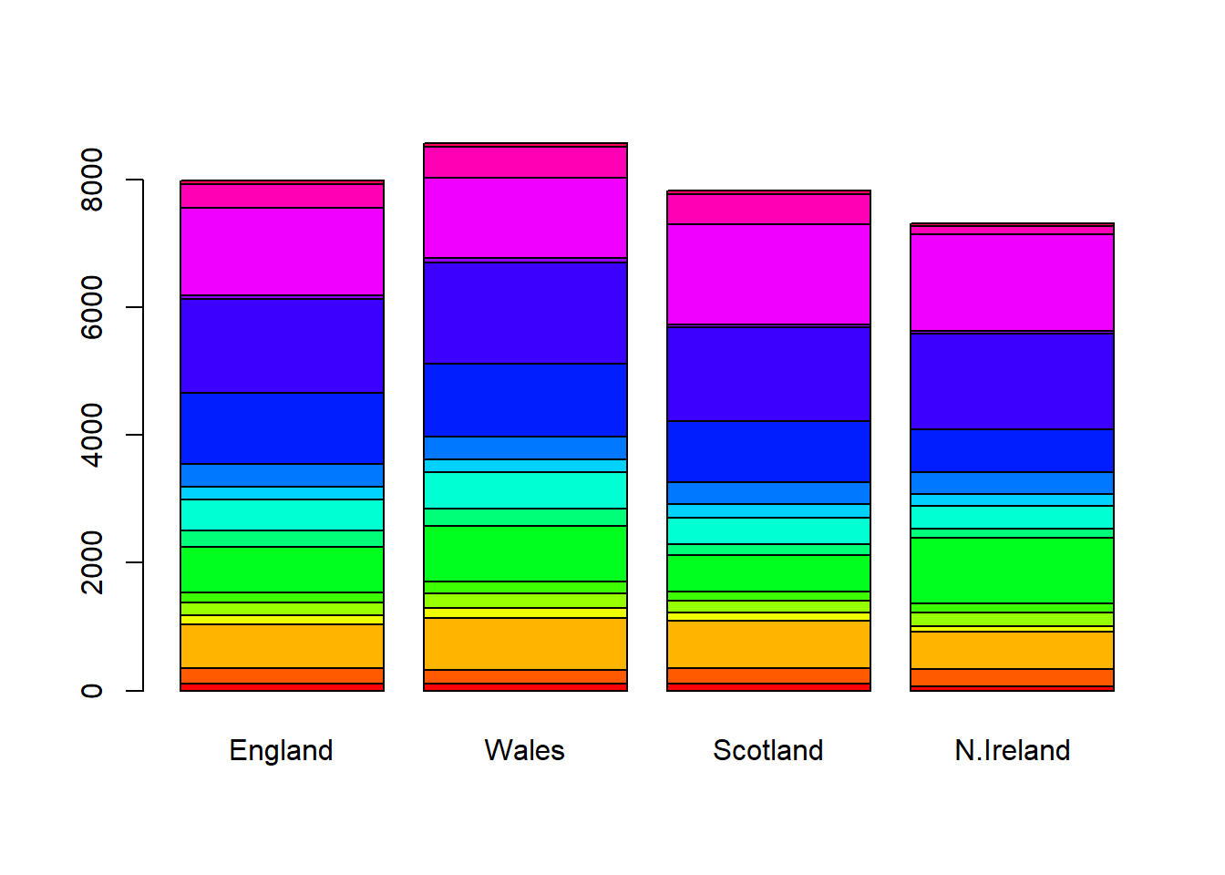
pairs(x, col=rainbow(nrow(x)), pch=16) 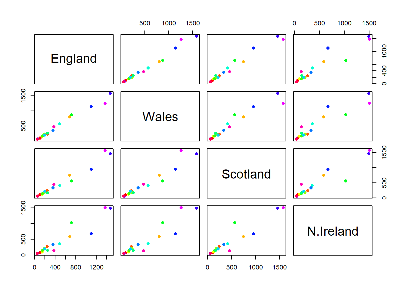
Q5: We can use the pairs() function to generate all pairwise plots for our countries. Can you make sense of the following code and resulting figure? What does it mean if a given point lies on the diagonal for a given plot?
It plots each country against each other. Points on the diagonal means they have the same value. If they are off the diagonal then they are different values. If the point above the diagonal then the y-axis category is higher than the x-axis category, and if below the diagonal then the x-axis is higher than the y-axis. The problem with this plot is that it doesn’t scale well.
library(pheatmap)
pheatmap( as.matrix(x) )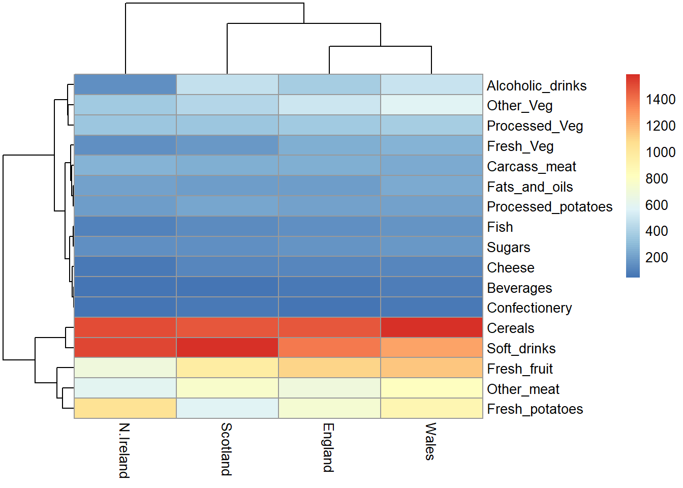
The main PCA function in “base R” is called prcomp(). This function wants the transpose of the food data as input (i.e. the foods as columns and the countries as rows).
pca <- prcomp(t(x))summary(pca)Importance of components:
PC1 PC2 PC3 PC4
Standard deviation 324.1502 212.7478 73.87622 3.176e-14
Proportion of Variance 0.6744 0.2905 0.03503 0.000e+00
Cumulative Proportion 0.6744 0.9650 1.00000 1.000e+00attributes(pca)$names
[1] "sdev" "rotation" "center" "scale" "x"
$class
[1] "prcomp"To make one of the main PCA result figures, we turn to pca$x the scores along our new PCs. This is called “PC plot” or “score plot” or “Ordination plot”.
pca$x PC1 PC2 PC3 PC4
England -144.99315 -2.532999 105.768945 -4.894696e-14
Wales -240.52915 -224.646925 -56.475555 5.700024e-13
Scotland -91.86934 286.081786 -44.415495 -7.460785e-13
N.Ireland 477.39164 -58.901862 -4.877895 2.321303e-13my_cols <- c("orange", "red","blue", "darkgreen")library(ggplot2)
ggplot(pca$x) + aes(PC1, PC2) + geom_point(col=my_cols)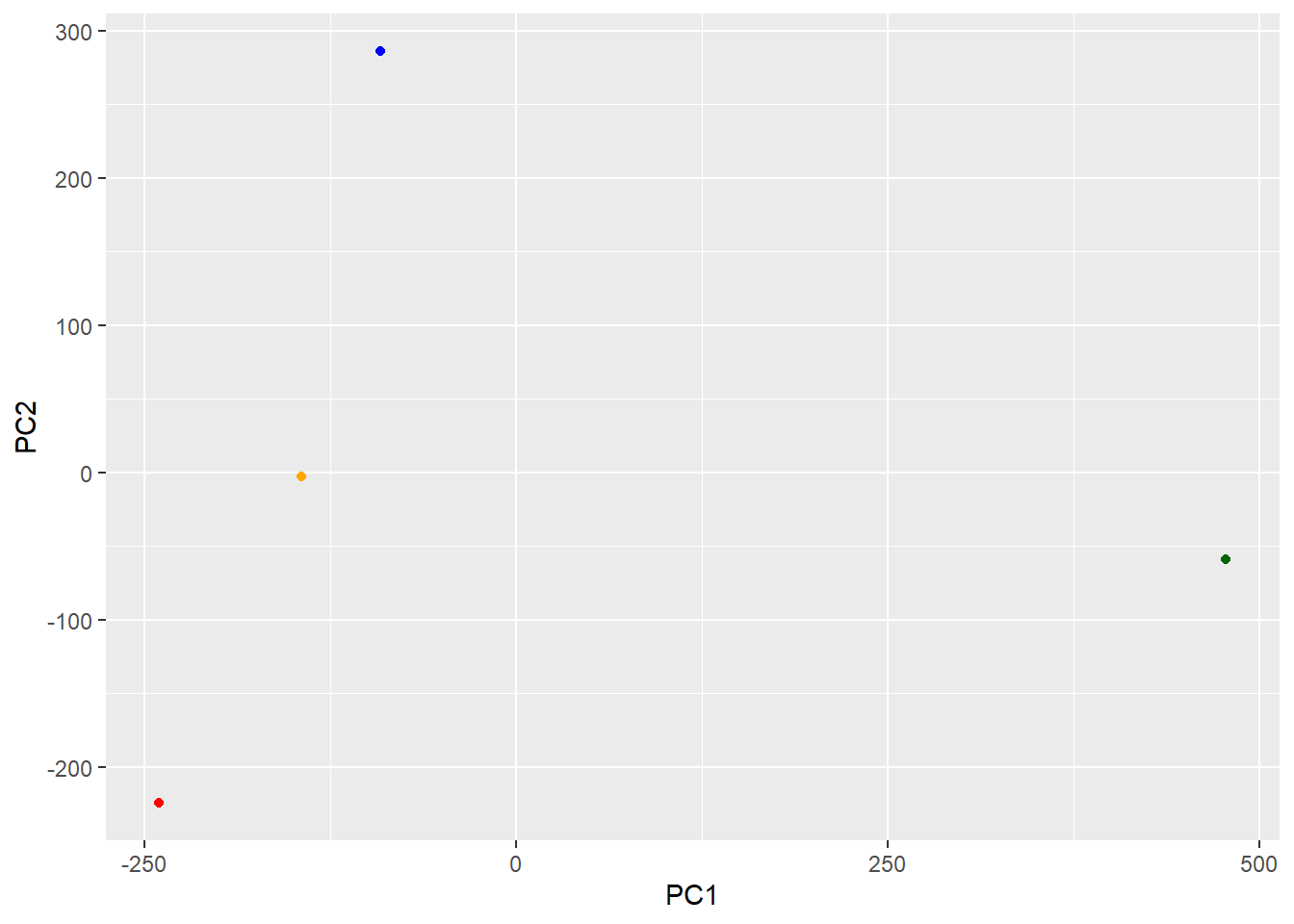
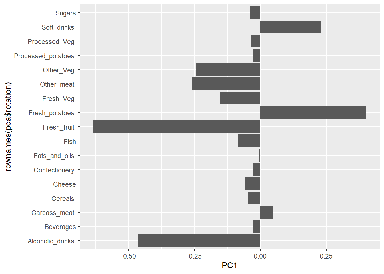
The second major result figure is called a “loadings plot” of “variable contributions plot” or “weight plot”
ggplot(pca$rotation) +
  aes(PC1, rownames(pca$rotation)) +
  geom_col()