wisc.df <- read.csv("WisconsinCancer.csv", row.names=1)Class08: Breast Cancer Mini Project
Background
In today’s class we will be employing all the R techniques for data analysis that we have learned thus far - including the machine learning methods of clustering and PCA - to analyze real breast cancer biopsy data.
The data is in CSV format:
We can have a peak at the data
head(wisc.df, 4) diagnosis radius_mean texture_mean perimeter_mean area_mean
842302 M 17.99 10.38 122.80 1001.0
842517 M 20.57 17.77 132.90 1326.0
84300903 M 19.69 21.25 130.00 1203.0
84348301 M 11.42 20.38 77.58 386.1
smoothness_mean compactness_mean concavity_mean concave.points_mean
842302 0.11840 0.27760 0.3001 0.14710
842517 0.08474 0.07864 0.0869 0.07017
84300903 0.10960 0.15990 0.1974 0.12790
84348301 0.14250 0.28390 0.2414 0.10520
symmetry_mean fractal_dimension_mean radius_se texture_se perimeter_se
842302 0.2419 0.07871 1.0950 0.9053 8.589
842517 0.1812 0.05667 0.5435 0.7339 3.398
84300903 0.2069 0.05999 0.7456 0.7869 4.585
84348301 0.2597 0.09744 0.4956 1.1560 3.445
area_se smoothness_se compactness_se concavity_se concave.points_se
842302 153.40 0.006399 0.04904 0.05373 0.01587
842517 74.08 0.005225 0.01308 0.01860 0.01340
84300903 94.03 0.006150 0.04006 0.03832 0.02058
84348301 27.23 0.009110 0.07458 0.05661 0.01867
symmetry_se fractal_dimension_se radius_worst texture_worst
842302 0.03003 0.006193 25.38 17.33
842517 0.01389 0.003532 24.99 23.41
84300903 0.02250 0.004571 23.57 25.53
84348301 0.05963 0.009208 14.91 26.50
perimeter_worst area_worst smoothness_worst compactness_worst
842302 184.60 2019.0 0.1622 0.6656
842517 158.80 1956.0 0.1238 0.1866
84300903 152.50 1709.0 0.1444 0.4245
84348301 98.87 567.7 0.2098 0.8663
concavity_worst concave.points_worst symmetry_worst
842302 0.7119 0.2654 0.4601
842517 0.2416 0.1860 0.2750
84300903 0.4504 0.2430 0.3613
84348301 0.6869 0.2575 0.6638
fractal_dimension_worst
842302 0.11890
842517 0.08902
84300903 0.08758
84348301 0.17300Q1. How many observations are in this dataset?
nrow(wisc.df)[1] 569Q2. How many of the observations have a malignant diagnosis
table(wisc.df$diagnosis)
  B   M
357 212
Q3. How many variables/features in the data are suffixed with _mean?
colnames(wisc.df) [1] "diagnosis" "radius_mean"
[3] "texture_mean" "perimeter_mean"
[5] "area_mean" "smoothness_mean"
[7] "compactness_mean" "concavity_mean"
[9] "concave.points_mean" "symmetry_mean"
[11] "fractal_dimension_mean" "radius_se"
[13] "texture_se" "perimeter_se"
[15] "area_se" "smoothness_se"
[17] "compactness_se" "concavity_se"
[19] "concave.points_se" "symmetry_se"
[21] "fractal_dimension_se" "radius_worst"
[23] "texture_worst" "perimeter_worst"
[25] "area_worst" "smoothness_worst"
[27] "compactness_worst" "concavity_worst"
[29] "concave.points_worst" "symmetry_worst"
[31] "fractal_dimension_worst"grep("_mean", colnames(wisc.df)) [1] 2 3 4 5 6 7 8 9 10 11length(grep("_mean", colnames(wisc.df)))[1] 10We need to remove the diagnosis column before we do any further analysis of this data set - we don’t want to pass this to PCA etc. We will save it as a separate vector that we can use later to compare our findings to those of experts.
wisc.data <- wisc.df[, -1]
diagnosis <- wisc.df$diagnosis
Principal Component Analysis (PCA)
The main function in base R is called prcomp(). We will use the optional arguments scale=TRUE here as the data columns/features/dimensions are on very different scales in the origianl data set.
wisc.pr <- prcomp(wisc.data, scale=TRUE)attributes(wisc.pr)$names
[1] "sdev" "rotation" "center" "scale" "x"
$class
[1] "prcomp"library(ggplot2)
ggplot(wisc.pr$x) +
aes(PC1, PC2, col=diagnosis) +
geom_point()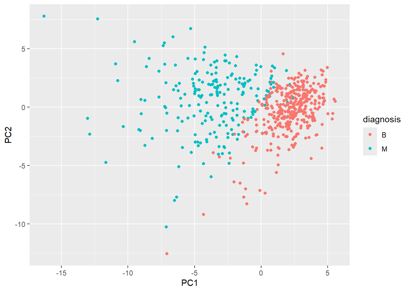
summary(wisc.pr)Importance of components:
PC1 PC2 PC3 PC4 PC5 PC6 PC7
Standard deviation 3.6444 2.3857 1.67867 1.40735 1.28403 1.09880 0.82172
Proportion of Variance 0.4427 0.1897 0.09393 0.06602 0.05496 0.04025 0.02251
Cumulative Proportion 0.4427 0.6324 0.72636 0.79239 0.84734 0.88759 0.91010
PC8 PC9 PC10 PC11 PC12 PC13 PC14
Standard deviation 0.69037 0.6457 0.59219 0.5421 0.51104 0.49128 0.39624
Proportion of Variance 0.01589 0.0139 0.01169 0.0098 0.00871 0.00805 0.00523
Cumulative Proportion 0.92598 0.9399 0.95157 0.9614 0.97007 0.97812 0.98335
PC15 PC16 PC17 PC18 PC19 PC20 PC21
Standard deviation 0.30681 0.28260 0.24372 0.22939 0.22244 0.17652 0.1731
Proportion of Variance 0.00314 0.00266 0.00198 0.00175 0.00165 0.00104 0.0010
Cumulative Proportion 0.98649 0.98915 0.99113 0.99288 0.99453 0.99557 0.9966
PC22 PC23 PC24 PC25 PC26 PC27 PC28
Standard deviation 0.16565 0.15602 0.1344 0.12442 0.09043 0.08307 0.03987
Proportion of Variance 0.00091 0.00081 0.0006 0.00052 0.00027 0.00023 0.00005
Cumulative Proportion 0.99749 0.99830 0.9989 0.99942 0.99969 0.99992 0.99997
PC29 PC30
Standard deviation 0.02736 0.01153
Proportion of Variance 0.00002 0.00000
Cumulative Proportion 1.00000 1.00000Q4. From your results, what proportion of the original variance is captured by the first principal component (PC1)?
summary(wisc.pr)$importance[2, 1][1] 0.44272Q5. How many principal components (PCs) are required to describe at least 70% of the original variance in the data?
table(summary(wisc.pr)$importance[3,] >= 0.70)
FALSE  TRUE
    2    28
Q6. How many principal components (PCs) are required to describe at least 90% of the original variance in the data?
table(summary(wisc.pr)$importance[3,] >= 0.90)
FALSE  TRUE
    6    24
Q7. What stands out to you about this plot? Is it easy or difficult to understand? Why?
biplot(wisc.pr)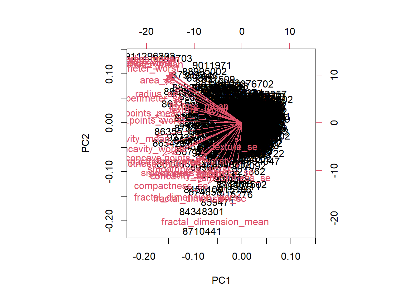
- The plot is messy and hard to understand, in that the data is very clustered together to where it is difficult to read each individual label and difficult to understand what the plot is actually trying to say. The plot also has numbers on all sides of the graph so it isn’t as clear to see which values are actually being compared to one another.
Q8. Generate a similar plot for principal components 1 and 3. What do you notice about these plots?
ggplot(wisc.pr$x) +
  aes(PC1, PC3, col=diagnosis) +
  geom_point()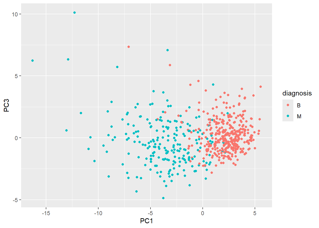
- The plot has an easy distinction between the variables and each individual patient can easily be seen and determined whether they are benign or malignant. It is also clear easier to see how the two different diagnosis compare to one another in value in that “M” occupies the left half of the graph and “B” the right half.
Q9. For the first principal component, what is the component of the loading vector (i.e. wisc.pr$rotation[,1]) for the feature concave.points_mean? This tells us how much this original feature contributes to the first PC. Are there any features with larger contributions than this one?
wisc.pr$rotation[,1] radius_mean texture_mean perimeter_mean
-0.21890244 -0.10372458 -0.22753729
area_mean smoothness_mean compactness_mean
-0.22099499 -0.14258969 -0.23928535
concavity_mean concave.points_mean symmetry_mean
-0.25840048 -0.26085376 -0.13816696
fractal_dimension_mean radius_se texture_se
-0.06436335 -0.20597878 -0.01742803
perimeter_se area_se smoothness_se
-0.21132592 -0.20286964 -0.01453145
compactness_se concavity_se concave.points_se
-0.17039345 -0.15358979 -0.18341740
symmetry_se fractal_dimension_se radius_worst
-0.04249842 -0.10256832 -0.22799663
texture_worst perimeter_worst area_worst
-0.10446933 -0.23663968 -0.22487053
smoothness_worst compactness_worst concavity_worst
-0.12795256 -0.21009588 -0.22876753
concave.points_worst symmetry_worst fractal_dimension_worst
-0.25088597 -0.12290456 -0.13178394 - The component of the loading vector for
concave.points_meanis -0.26, in which the negative sign means it decreases the value of the PC. Given that there is no other value that is bigger thanconcave.points_mean, this loading vector is the largest contributor.
Hierarchical Clustering
The goal of this section is to do hierarchical clustering of the original data to see if there is any obvious grouping into malignant and benign clusters.
The results are not good
First, we will scale our wisc.data then calculated a distance matrix, then pass to hclust():
wisc.dist <- dist(scale(wisc.data))
wisc.hclust <- hclust(wisc.dist)
plot(wisc.hclust)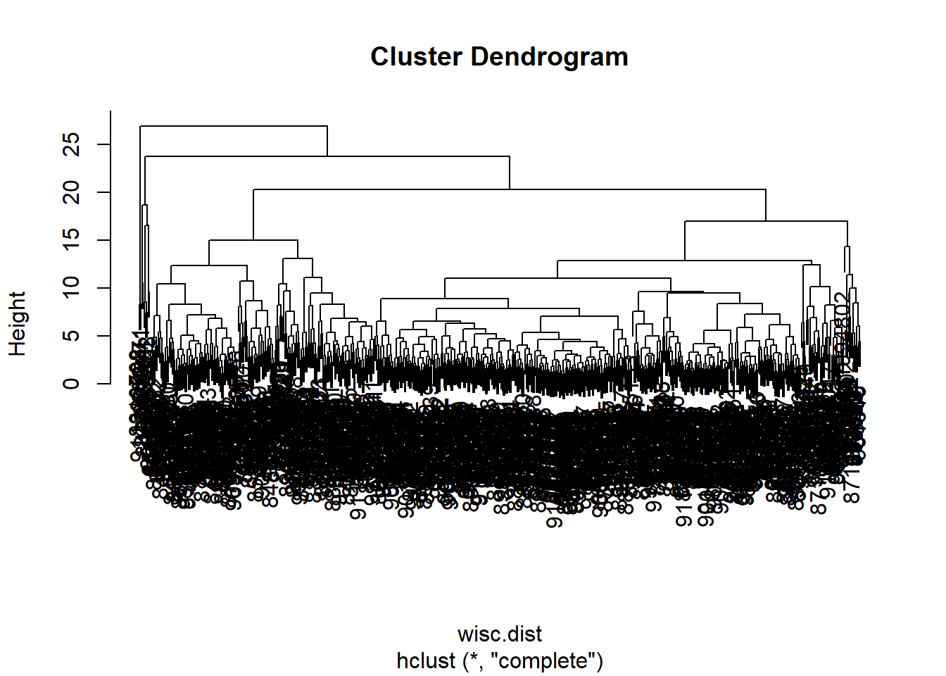
wisc.hclust.clusters <- cutree(wisc.hclust, k=2)
table(wisc.hclust.clusters)
wisc.hclust.clusters
1 2
567 2 Q10. Using the plot() and abline() functions, what is the height at which the clustering model has 4 clusters?
plot(wisc.hclust)
abline(h=19.5, col="red", lty=2)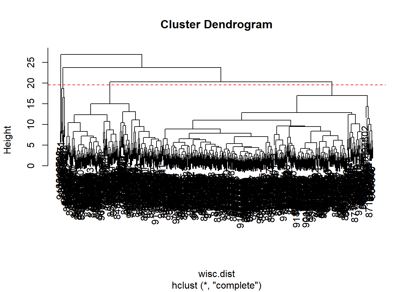
Q12. Which method gives your favorite results for the same
data.dist()dataset?
- The method “ward.D2” has favored results as it is less messy and crowded to look at, in that the clusters can be easily seen from orrignating from the first cluster. The second would be the method “complete” for the same reasons but there are more clusters that are produced, which can be good or not as needed depending on what is looked for
hc.complete <- hclust(wisc.dist, method="complete")
plot(hc.complete)
hc.single <- hclust(wisc.dist, method="single")
plot(hc.single)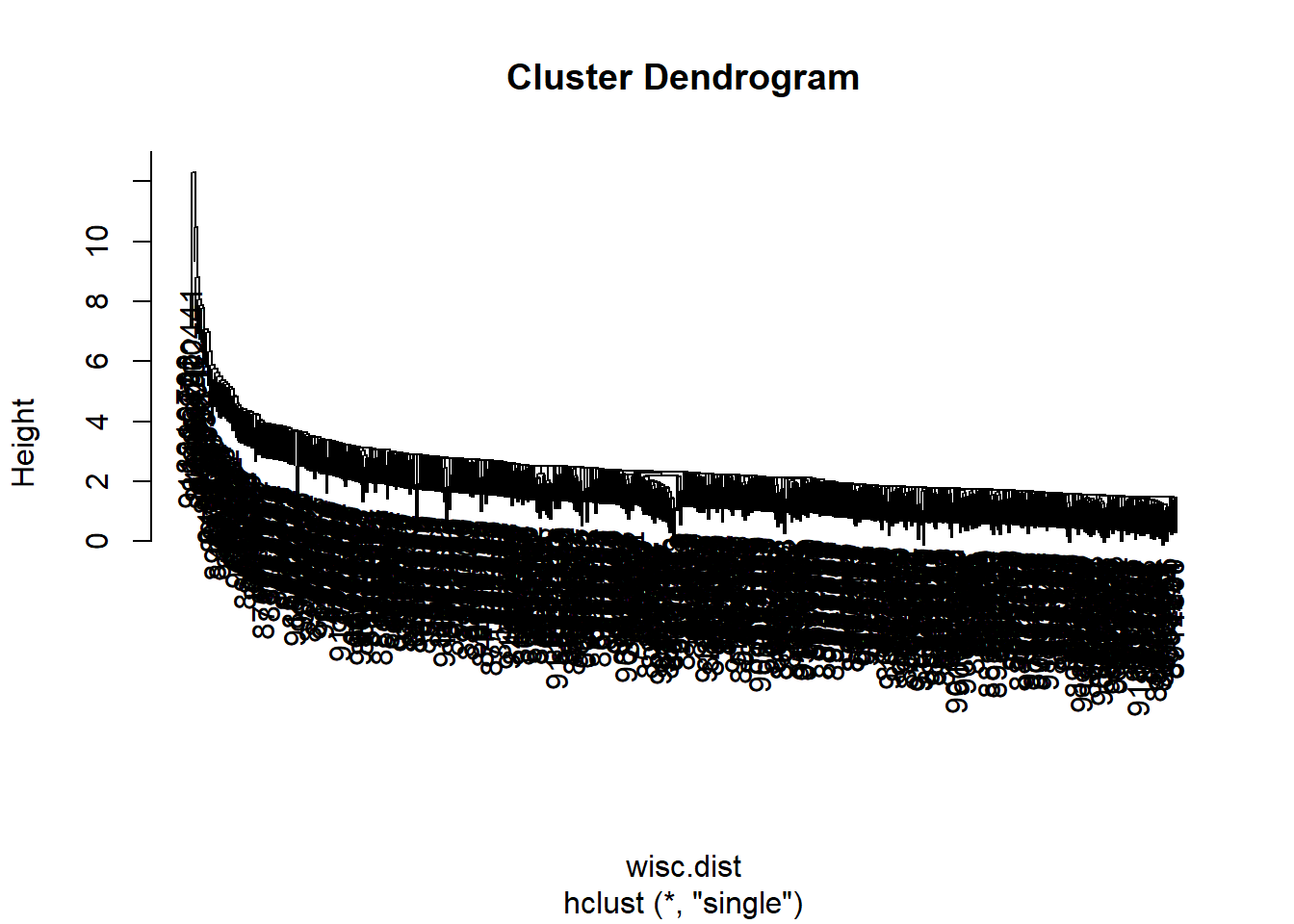
hc.average <- hclust(wisc.dist, method = "average")
plot(hc.average)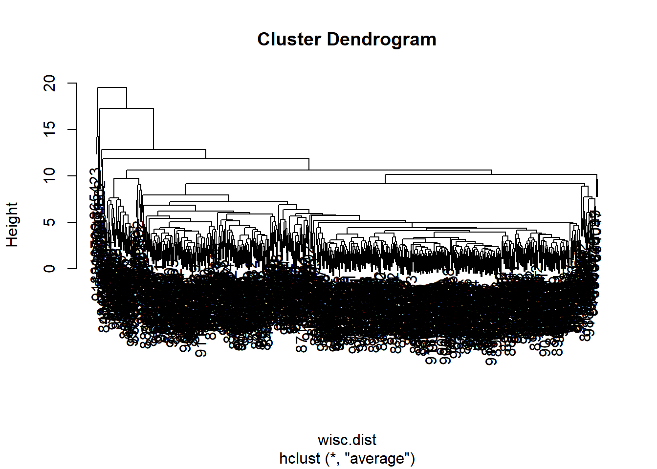
hc.ward <- hclust(wisc.dist, method="ward.D2")
plot(hc.ward)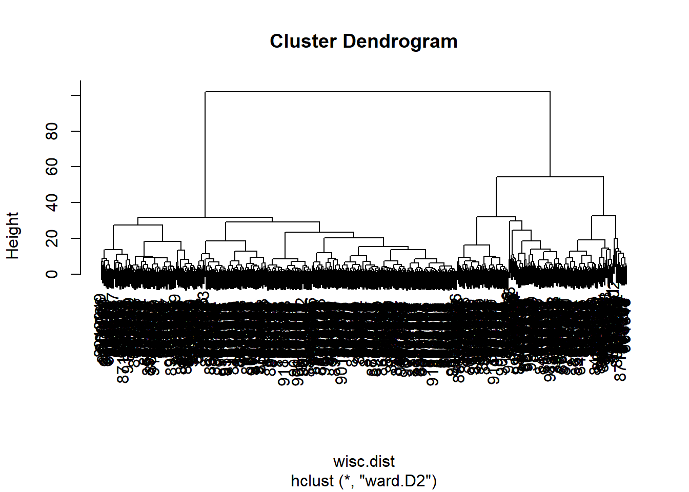
Combining Methods
The idea here is that I can take my new variables (the scores on the PCs wisc.pr$x) that are better descriptors of the data set than the original features (i.e. the 30 columns in wisc.data) and use these as a basis for clustering.
pc.dist <- dist(wisc.pr$x[,1:3])
wisc.pr.hclust <- hclust(pc.dist, method="ward.D2")
plot(wisc.pr.hclust)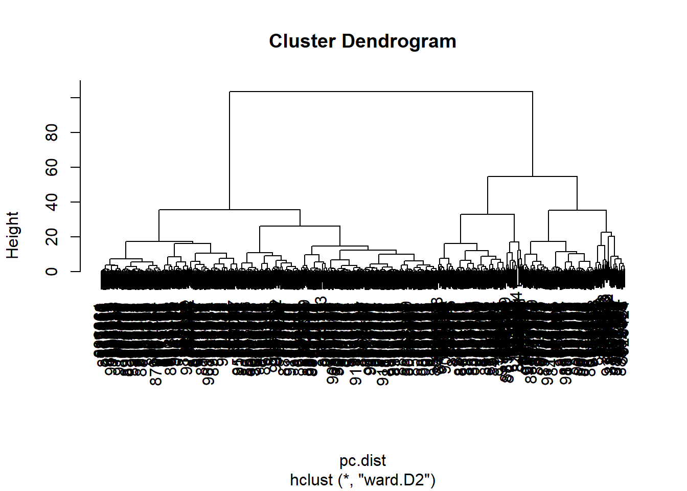
grps <- cutree(wisc.pr.hclust, k=2)
table(grps)
grps
1 2
203 366 table(diagnosis)diagnosis
B M
357 212 I can now run table() with both my clustering grps and the expert diagnosis
Q13. How well does the newly created
hclust()model with the two clusters separate out the two “M” and “B” diagnoses?
table(grps, diagnosis) diagnosis
grps B M
1 24 179
2 333 33Q14. How well do the hierarchical clustering models created do in terms of separating the diagnoses
Our cluster “1” has 179 “M” diagnosis
- True Positive (TP): 179 False Positive (FP): 24
Our cluster “2” has 333 “B” diagnosis
- True Negative (TN): 333
- False Negative (FN): 33
ftable(grps, wisc.hclust.clusters, diagnosis) diagnosis B M
grps wisc.hclust.clusters
1 1 24 177
2 0 2
2 1 333 33
2 0 0Sensitivity + Specificity
Sensitivity: TP/(TP+FN)
179/(179+33)[1] 0.8443396Perfect: Sensitivity of 1
Specificity: TN/(TN+FP)
333/(333+24)[1] 0.9327731Prediction
We can use our PCA model for prediction of new un-seen cases:
url <- "https://tinyurl.com/new-samples-CSV"
new <- read.csv(url)
npc <- predict(wisc.pr, newdata=new)
npc
PC1 PC2 PC3 PC4 PC5 PC6 PC7
[1,] 2.576616 -3.135913 1.3990492 -0.7631950 2.781648 -0.8150185 -0.3959098
[2,] -4.754928 -3.009033 -0.1660946 -0.6052952 -1.140698 -1.2189945 0.8193031
PC8 PC9 PC10 PC11 PC12 PC13 PC14
[1,] -0.2307350 0.1029569 -0.9272861 0.3411457 0.375921 0.1610764 1.187882
[2,] -0.3307423 0.5281896 -0.4855301 0.7173233 -1.185917 0.5893856 0.303029
PC15 PC16 PC17 PC18 PC19 PC20
[1,] 0.3216974 -0.1743616 -0.07875393 -0.11207028 -0.08802955 -0.2495216
[2,] 0.1299153 0.1448061 -0.40509706 0.06565549 0.25591230 -0.4289500
PC21 PC22 PC23 PC24 PC25 PC26
[1,] 0.1228233 0.09358453 0.08347651 0.1223396 0.02124121 0.078884581
[2,] -0.1224776 0.01732146 0.06316631 -0.2338618 -0.20755948 -0.009833238
PC27 PC28 PC29 PC30
[1,] 0.220199544 -0.02946023 -0.015620933 0.005269029
[2,] -0.001134152 0.09638361 0.002795349 -0.019015820plot(wisc.pr$x[,1:2], col=grps)
points(npc[,1], npc[,2], col="blue", pch=16, cex=3)
text(npc[,1], npc[,2], c(1,2), col="white")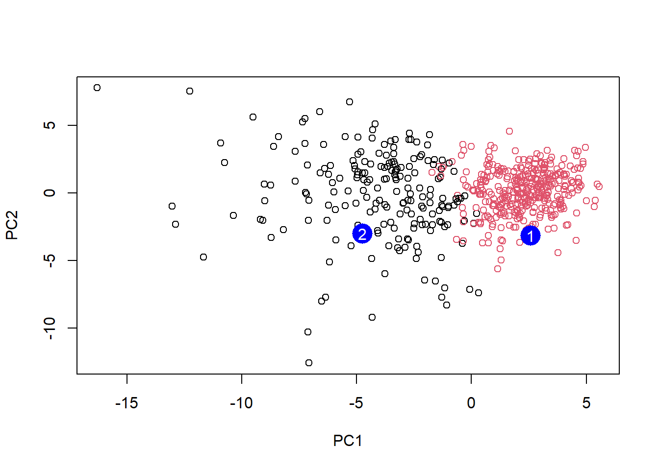
Q16. Which of these new patients should be prioritized for follow up based on the results
- Patient two should be prioritized as its PC1 value of -5 means that it is a greater influence to the value of the PC. Based on the previous graphs, patient two would have been diagnosed with a malignant tumor whereas patient one would have been diagnosed with a benign tumor.