candy_file <- read.csv("candy-data.csv")Class09 Candy Mini Project
Background
We will be using a candy data set to identify its variables needing special handling, create bar and scatter plots using ggprel() and ploty(), create correlation matrixes, and conduct and interpret PCA. In other words, we will analyze candy data with the exploratory graphics, basic statistics, correlation analysis and principal component analysis methods we have been learning thus far.
Data Import
The data is in the form of a CSV file from 538.
candy = data.frame(candy_file, row.names=1)
head(candy)
chocolate fruity caramel peanutyalmondy nougat crispedricewafer
100 Grand 1 0 1 0 0 1
3 Musketeers 1 0 0 0 1 0
One dime 0 0 0 0 0 0
One quarter 0 0 0 0 0 0
Air Heads 0 1 0 0 0 0
Almond Joy 1 0 0 1 0 0
hard bar pluribus sugarpercent pricepercent winpercent
100 Grand 0 1 0 0.732 0.860 66.97173
3 Musketeers 0 1 0 0.604 0.511 67.60294
One dime 0 0 0 0.011 0.116 32.26109
One quarter 0 0 0 0.011 0.511 46.11650
Air Heads 0 0 0 0.906 0.511 52.34146
Almond Joy 0 1 0 0.465 0.767 50.34755Q1. How many different candy types are in this dataset?
- There are 85 rows in this data set
nrow(candy)[1] 85Q2. How many fruity candy types are in the dataset?
- There are 38 fruity candy types in the data set
table(candy$fruity)
 0  1
47 38 sum(candy$fruity)[1] 38Because the data set has each candy name set as the row names, we can access winpercent by using its name to obtain the corresponding row.
candy["Twix",]$winpercent[1] 81.64291We can also use the dplyr package
library(dplyr)
Attaching package: 'dplyr'The following objects are masked from 'package:stats':
filter, lagThe following objects are masked from 'package:base':
intersect, setdiff, setequal, union candy |>
filter(row.names(candy)=="Twix") |>
select(winpercent) winpercent
Twix 81.64291Q3. What is your favorite candy in the dataset and what is it’s
winpercentvalue
candy |>
  filter(row.names(candy)=="Hershey's Milk Chocolate") |>
  select(winpercent)
winpercent
Hershey's Milk Chocolate 56.4905This can also be written in base R format as:
candy["Hershey's Milk Chocolate", "winpercent"][1] 56.4905Q4. What is the
winpercentvalue for “Kit Kat”?
candy |>
  filter(row.names(candy)=="Kit Kat") |>
  select(winpercent)
winpercent
Kit Kat 76.7686Q5. What is the
winpercentvalue for “Tootsie Roll Snack Bars”?
candy |>
  filter(row.names(candy)=="Tootsie Roll Snack Bars") |>
  select(winpercent)
winpercent
Tootsie Roll Snack Bars 49.6535We can use the skim() function from the skimr package to get a quick overview of the data set
library("skimr")skim(candy)| Name | candy |
| Number of rows | 85 |
| Number of columns | 12 |
| _______________________ | |
| Column type frequency: | |
| numeric | 12 |
| ________________________ | |
| Group variables | None |
Variable type: numeric
| skim_variable | n_missing | complete_rate | mean | sd | p0 | p25 | p50 | p75 | p100 | hist |
|---|---|---|---|---|---|---|---|---|---|---|
| chocolate | 0 | 1 | 0.44 | 0.50 | 0.00 | 0.00 | 0.00 | 1.00 | 1.00 | ▇▁▁▁▆ |
| fruity | 0 | 1 | 0.45 | 0.50 | 0.00 | 0.00 | 0.00 | 1.00 | 1.00 | ▇▁▁▁▆ |
| caramel | 0 | 1 | 0.16 | 0.37 | 0.00 | 0.00 | 0.00 | 0.00 | 1.00 | ▇▁▁▁▂ |
| peanutyalmondy | 0 | 1 | 0.16 | 0.37 | 0.00 | 0.00 | 0.00 | 0.00 | 1.00 | ▇▁▁▁▂ |
| nougat | 0 | 1 | 0.08 | 0.28 | 0.00 | 0.00 | 0.00 | 0.00 | 1.00 | ▇▁▁▁▁ |
| crispedricewafer | 0 | 1 | 0.08 | 0.28 | 0.00 | 0.00 | 0.00 | 0.00 | 1.00 | ▇▁▁▁▁ |
| hard | 0 | 1 | 0.18 | 0.38 | 0.00 | 0.00 | 0.00 | 0.00 | 1.00 | ▇▁▁▁▂ |
| bar | 0 | 1 | 0.25 | 0.43 | 0.00 | 0.00 | 0.00 | 0.00 | 1.00 | ▇▁▁▁▂ |
| pluribus | 0 | 1 | 0.52 | 0.50 | 0.00 | 0.00 | 1.00 | 1.00 | 1.00 | ▇▁▁▁▇ |
| sugarpercent | 0 | 1 | 0.48 | 0.28 | 0.01 | 0.22 | 0.47 | 0.73 | 0.99 | ▇▇▇▇▆ |
| pricepercent | 0 | 1 | 0.47 | 0.29 | 0.01 | 0.26 | 0.47 | 0.65 | 0.98 | ▇▇▇▇▆ |
| winpercent | 0 | 1 | 50.32 | 14.71 | 22.45 | 39.14 | 47.83 | 59.86 | 84.18 | ▃▇▆▅▂ |
Q6. Is there any variable/column that looks to be on a different scale to the majority of the other columns in the dataset?
- The
p100column looks to be on a different scale compared to the majority in that it’s consistently in the range from 0.98 to 1, with the exception of the winpercent.
Q7. What do you think a zero and one represnt for the
candy$chocolatecolumn
- The 0 under
n_missingmeans there are 0 missing values in relation to cho
skim(candy$chocolate)| Name | candy$chocolate |
| Number of rows | 85 |
| Number of columns | 1 |
| _______________________ | |
| Column type frequency: | |
| numeric | 1 |
| ________________________ | |
| Group variables | None |
Variable type: numeric
| skim_variable | n_missing | complete_rate | mean | sd | p0 | p25 | p50 | p75 | p100 | hist |
|---|---|---|---|---|---|---|---|---|---|---|
| data | 0 | 1 | 0.44 | 0.5 | 0 | 0 | 0 | 1 | 1 | ▇▁▁▁▆ |
Exploratory Analysis
Q8. Plot a histogram of
winpercentvalues using both base R and ggplot2
hist(candy$winpercent, breaks=15)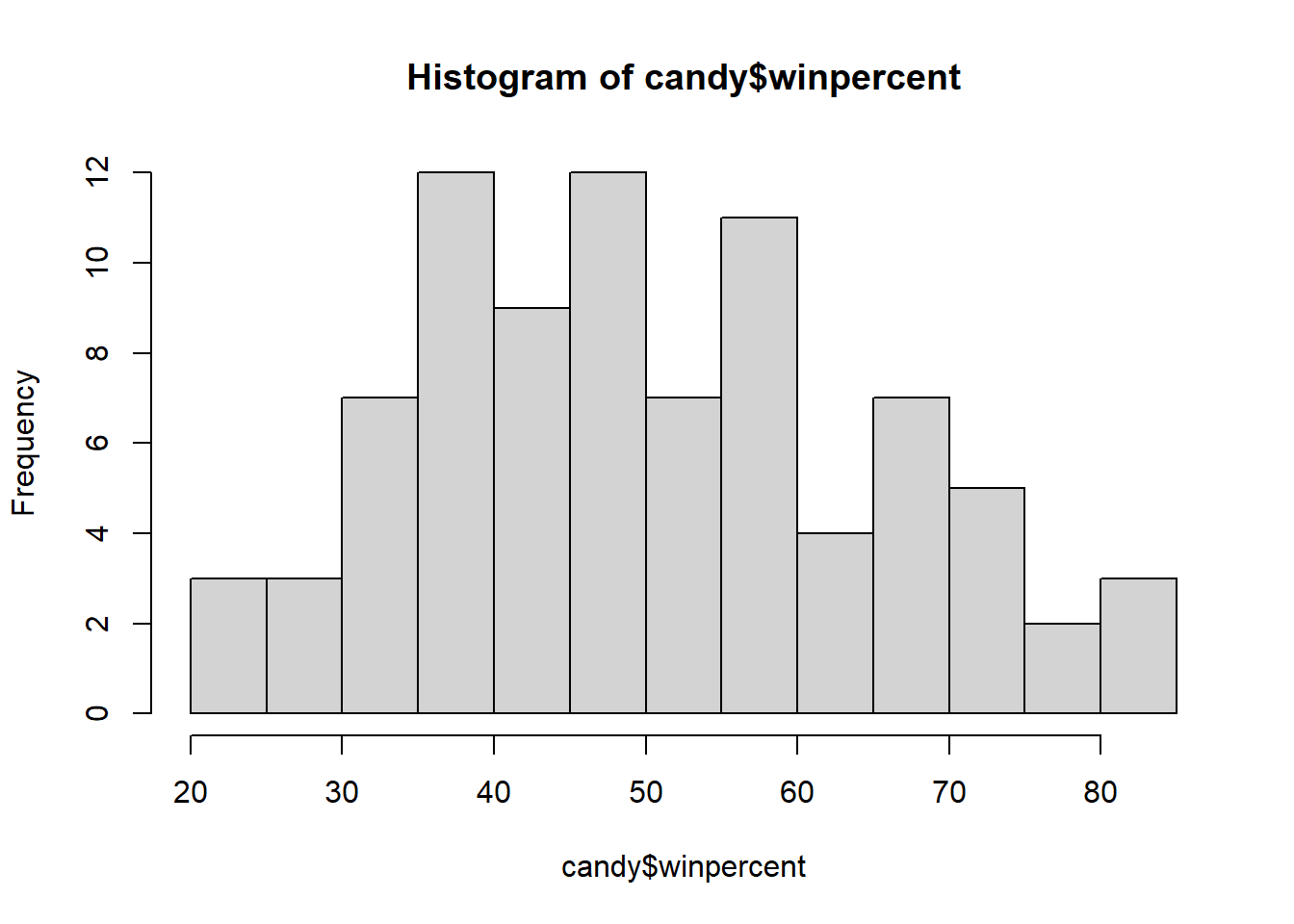
library("ggplot2")ggplot(candy) +
aes(winpercent) +
geom_histogram(bins=15, col="darkgray", fill="lightblue")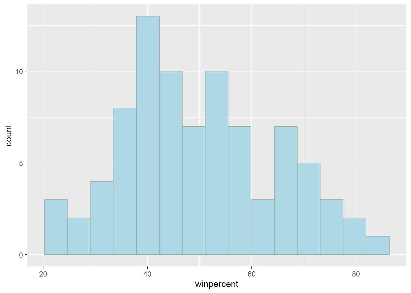
For simple view of the distribution, base R is quicker
Q9. Is the distribution of
winpercentvalues symmetrical
- The distribution is not symmetrical regardless of the number of bins or breaks used
Q10. Is the center of the distribution above or below 50%
- The center of distribution is above 50%
mean(candy$winpercent)[1] 50.31676summary(candy$winpercent) Min. 1st Qu. Median Mean 3rd Qu. Max.
22.45 39.14 47.83 50.32 59.86 84.18 Q11. On average, is chocolate candy higher or lower ranked than fruit candy
- Chocolate candy is higher ranked than fruit candy with a mean of 0.44
Steps 1. Find all the chocolate candy in the data set 2. Extract or find their winpercent values 3. Calculate the mean of these values 4. Find all the fruity candy in the data set 5. Find their winpercent values 6. Calculate their mean values
choc.candy <- candy[candy$chocolate == 1, ]
choc.win <- choc.candy$winpercent
mean(choc.candy$winpercent)
[1] 60.92153fruity.candy <- candy[candy$fruity == 1, ]
fruit.win <- fruity.candy$winpercent
mean(fruity.candy$winpercent)[1] 44.11974Q12. Is this difference statistically significant
- The difference is statistically significant based on p=0.05>2.871e-08
t.test(choc.win, fruit.win)
    Welch Two Sample t-test

data:  choc.win and fruit.win
t = 6.2582, df = 68.882, p-value = 2.871e-08
alternative hypothesis: true difference in means is not equal to 0
95 percent confidence interval:
 11.44563 22.15795
sample estimates:
mean of x mean of y
 60.92153  44.11974
Overall Candy Rankings
y <- c("z", "c", "a")
sort(y)
[1] "a" "c" "z"y <- c("z", "c", "a")
order(y)[1] 3 2 1y[order(y)][1] "a" "c" "z"sort(candy$winpercent) [1] 22.44534 23.41782 24.52499 27.30386 28.12744 29.70369 32.23100 32.26109
[9] 33.43755 34.15896 34.51768 34.57899 34.72200 35.29076 36.01763 37.34852
[17] 37.72234 37.88719 38.01096 38.97504 39.01190 39.14106 39.18550 39.44680
[25] 39.46056 41.26551 41.38956 41.90431 42.17877 42.27208 42.84914 43.06890
[33] 43.08892 44.37552 45.46628 45.73675 45.99583 46.11650 46.29660 46.41172
[41] 46.78335 47.17323 47.82975 48.98265 49.52411 49.65350 50.34755 51.41243
[49] 52.34146 52.82595 52.91139 54.52645 54.86111 55.06407 55.10370 55.35405
[57] 55.37545 56.49050 56.91455 57.11974 57.21925 59.23612 59.52925 59.86400
[65] 60.80070 62.28448 63.08514 64.35334 65.71629 66.47068 66.57458 66.97173
[73] 67.03763 67.60294 69.48379 70.73564 71.46505 72.88790 73.09956 73.43499
[81] 76.67378 76.76860 81.64291 81.86626 84.18029base R:
inds <- order(candy$winpercent) candy[inds,]
Q13. What are the five least liked candy types in this set
head(candy[order(candy$winpercent),], n=5) chocolate fruity caramel peanutyalmondy nougat
Nik L Nip 0 1 0 0 0
Boston Baked Beans 0 0 0 1 0
Chiclets 0 1 0 0 0
Super Bubble 0 1 0 0 0
Jawbusters 0 1 0 0 0
crispedricewafer hard bar pluribus sugarpercent pricepercent
Nik L Nip 0 0 0 1 0.197 0.976
Boston Baked Beans 0 0 0 1 0.313 0.511
Chiclets 0 0 0 1 0.046 0.325
Super Bubble 0 0 0 0 0.162 0.116
Jawbusters 0 1 0 1 0.093 0.511
winpercent
Nik L Nip 22.44534
Boston Baked Beans 23.41782
Chiclets 24.52499
Super Bubble 27.30386
Jawbusters 28.12744Q14. What are the top 5 all time favorite candy types out of this set?
tail(candy[order(candy$winpercent),], n=5) chocolate fruity caramel peanutyalmondy nougat
Snickers 1 0 1 1 1
Kit Kat 1 0 0 0 0
Twix 1 0 1 0 0
Reese's Miniatures 1 0 0 1 0
Reese's Peanut Butter cup 1 0 0 1 0
crispedricewafer hard bar pluribus sugarpercent
Snickers 0 0 1 0 0.546
Kit Kat 1 0 1 0 0.313
Twix 1 0 1 0 0.546
Reese's Miniatures 0 0 0 0 0.034
Reese's Peanut Butter cup 0 0 0 0 0.720
pricepercent winpercent
Snickers 0.651 76.67378
Kit Kat 0.511 76.76860
Twix 0.906 81.64291
Reese's Miniatures 0.279 81.86626
Reese's Peanut Butter cup 0.651 84.18029Q15. Make a first barplot of candy ranking based on
winpercentvalues
ggplot(candy) +
  aes(winpercent,rownames(candy)) +
  geom_col() +
  ylab("")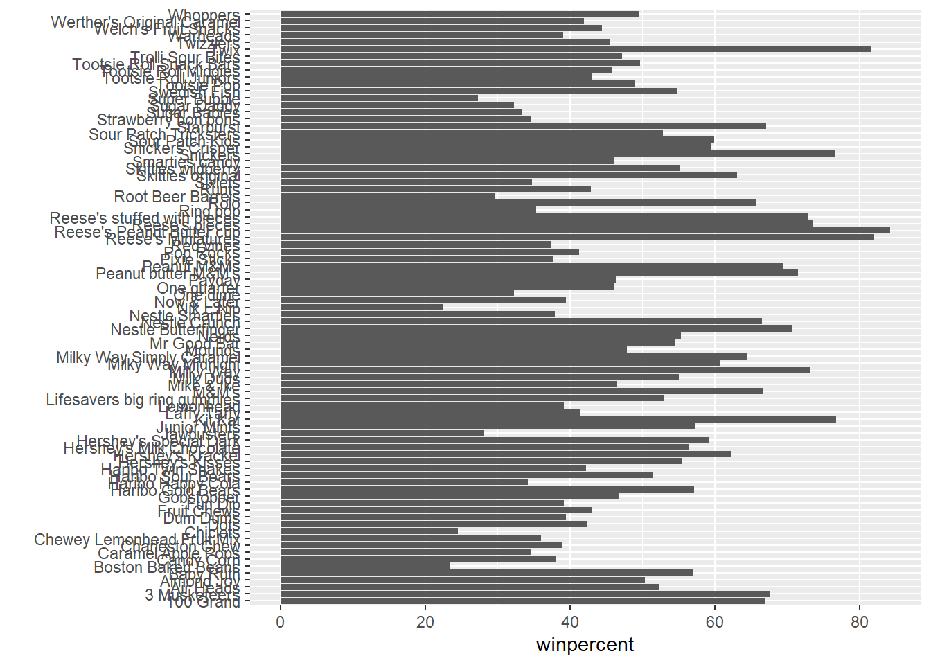
ggsave("barplot1.png", height=10, width=6)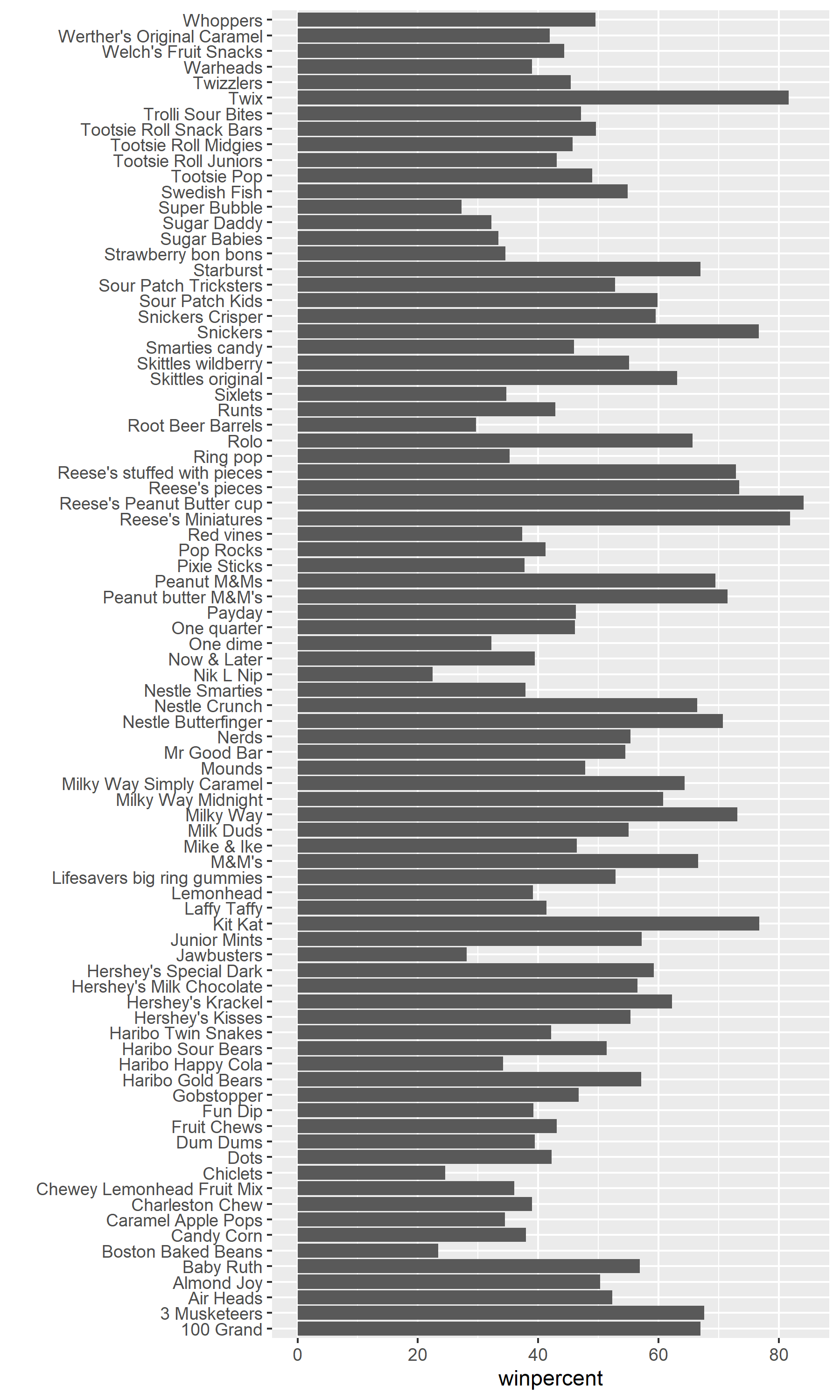
Q16. Use the
reorder()function to get the bars sorted bywinpercent
ggplot(candy) +
  aes(winpercent,reorder(rownames(candy), winpercent)) +
  geom_col() +ylab("")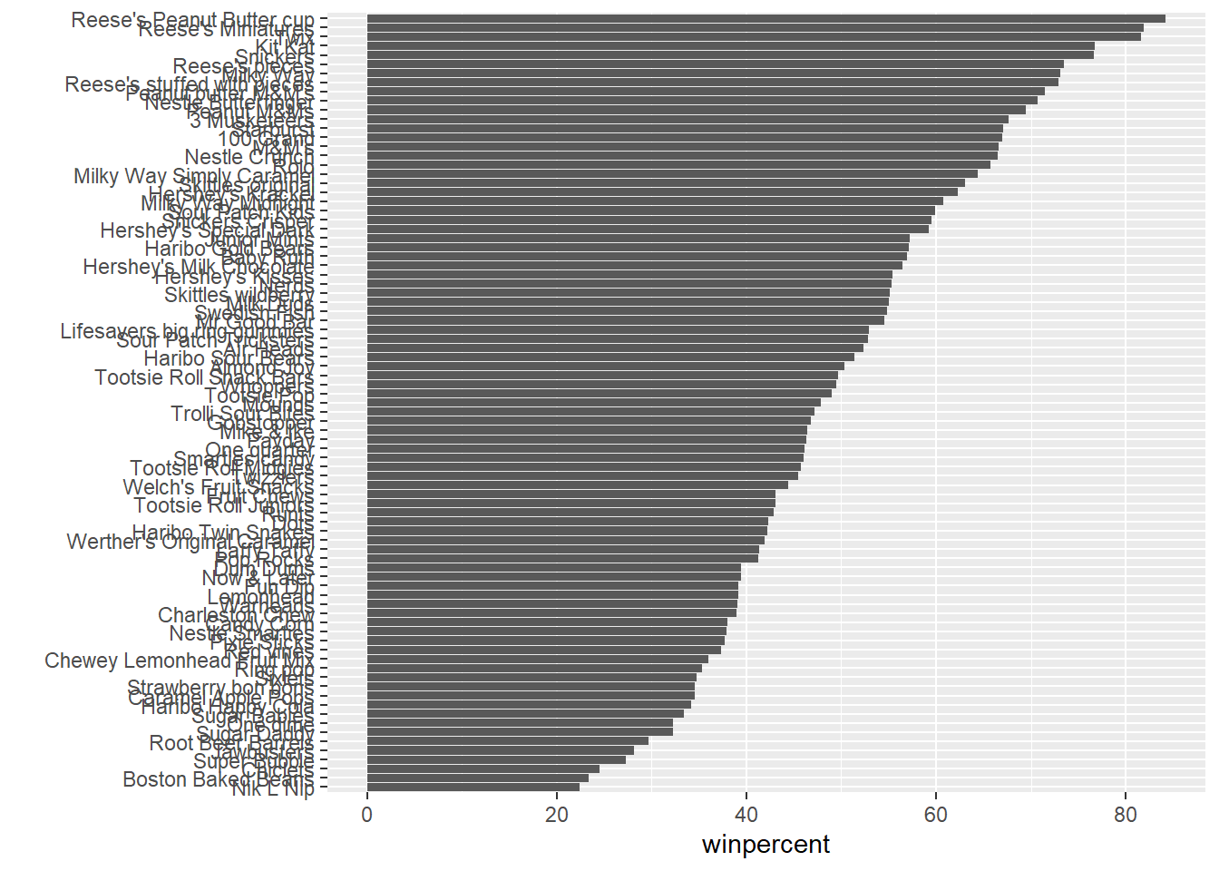
Adding color
Color by chocolate
ggplot(candy) +
  aes(winpercent,reorder(rownames(candy), winpercent),
      fill=chocolate) +
  geom_col() +ylab("")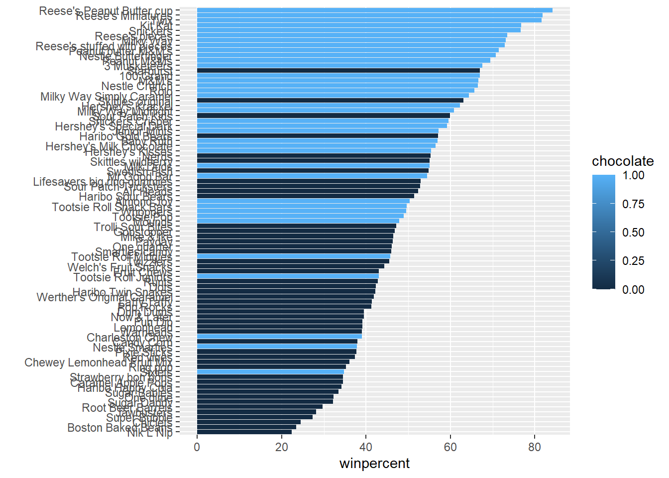
We don’t want to make separate plots to color each variable.
We can create color vector to signify the candy types since we want custom colors
my_cols=rep("black", nrow(candy))
my_cols[as.logical(candy$chocolate)] = "chocolate"
my_cols[as.logical(candy$bar)] = "brown"
my_cols[as.logical(candy$fruity)] = "pink"
Another way to write the vector
my_cols <- rep("black", nrow(candy))
my_cols[candy$chocolate==1] <- "chocolate"
my_cols[candy$bar==1] <-  "brown"
my_cols[candy$fruity==1] <- "pink"ggplot(candy) +
aes(winpercent, reorder(rownames(candy),winpercent)) +
geom_col(fill=my_cols) + ylab("")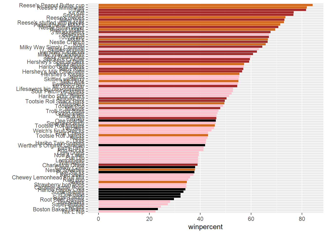
Q17. What is the worst ranked chocolate candy?
- The worst ranked chocolate candy is Sixlets
Q18. What is the best ranked fruity candy?
- The best ranked fruity candy is Starburst
Taking a look at pricepercent
We can also look at the pricepercent in which lower values represent the less expensive candy and the higher values represent the more expensive candy. We can plot the pricepercent against the winpercent.
We can use the ggrepel package for better label placement:
library(ggrepel)ggplot(candy) +
aes(winpercent, pricepercent, label=rownames(candy)) +
geom_point(col=my_cols) +
geom_text_repel(col=my_cols, size=3.3, max.overlaps = 8)Warning: ggrepel: 32 unlabeled data points (too many overlaps). Consider
increasing max.overlaps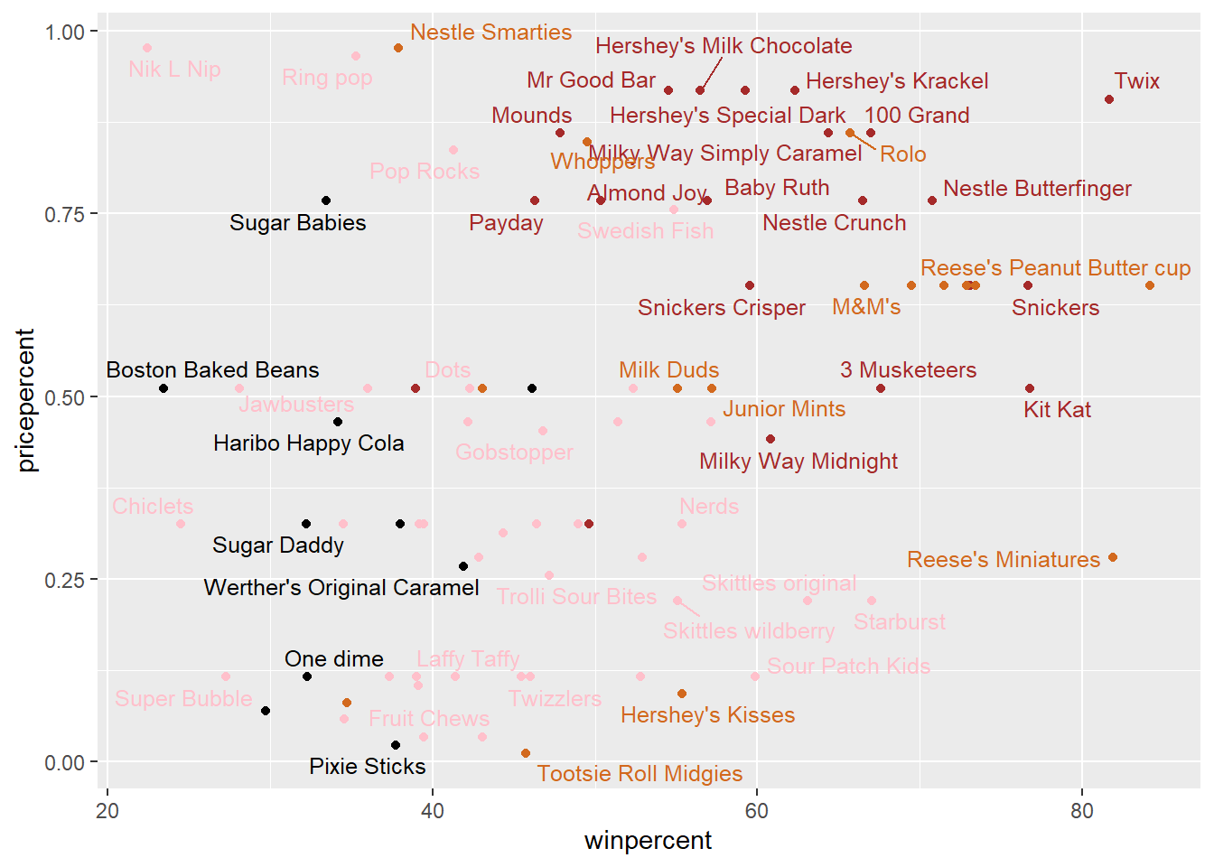
ord <- order(candy$pricepercent, decreasing = TRUE)
head( candy[ord,c(11,12)], n=5 )
pricepercent winpercent
Nik L Nip 0.976 22.44534
Nestle Smarties 0.976 37.88719
Ring pop 0.965 35.29076
Hershey's Krackel 0.918 62.28448
Hershey's Milk Chocolate 0.918 56.49050Q19. Which candy type is the highest ranked in terms of winpercent for the least money - i.e. offers the most bang for your buck?
- Tootsie Roll Midgies
ord <- order(candy$pricepercent, decreasing = FALSE)
head( candy[ord,c(11,12)], n=5 )
pricepercent winpercent
Tootsie Roll Midgies 0.011 45.73675
Pixie Sticks 0.023 37.72234
Dum Dums 0.034 39.46056
Fruit Chews 0.034 43.08892
Strawberry bon bons 0.058 34.57899Q20. What are the top 5 most expensive candy types in the dataset and of these which is the least popular?
- Nik L Nip
ord <- order(candy$pricepercent, decreasing = TRUE)
head( candy[ord,c(11,12)], n=5 )
pricepercent winpercent
Nik L Nip 0.976 22.44534
Nestle Smarties 0.976 37.88719
Ring pop 0.965 35.29076
Hershey's Krackel 0.918 62.28448
Hershey's Milk Chocolate 0.918 56.49050Exploring the Correlation Structure
Pearson correlation values range from -1 to +1. The values closer to 0 has significantly less correlation compared to values closer to 1.
library(corrplot)corrplot 0.95 loadedcij <- cor(candy)
corrplot(cij)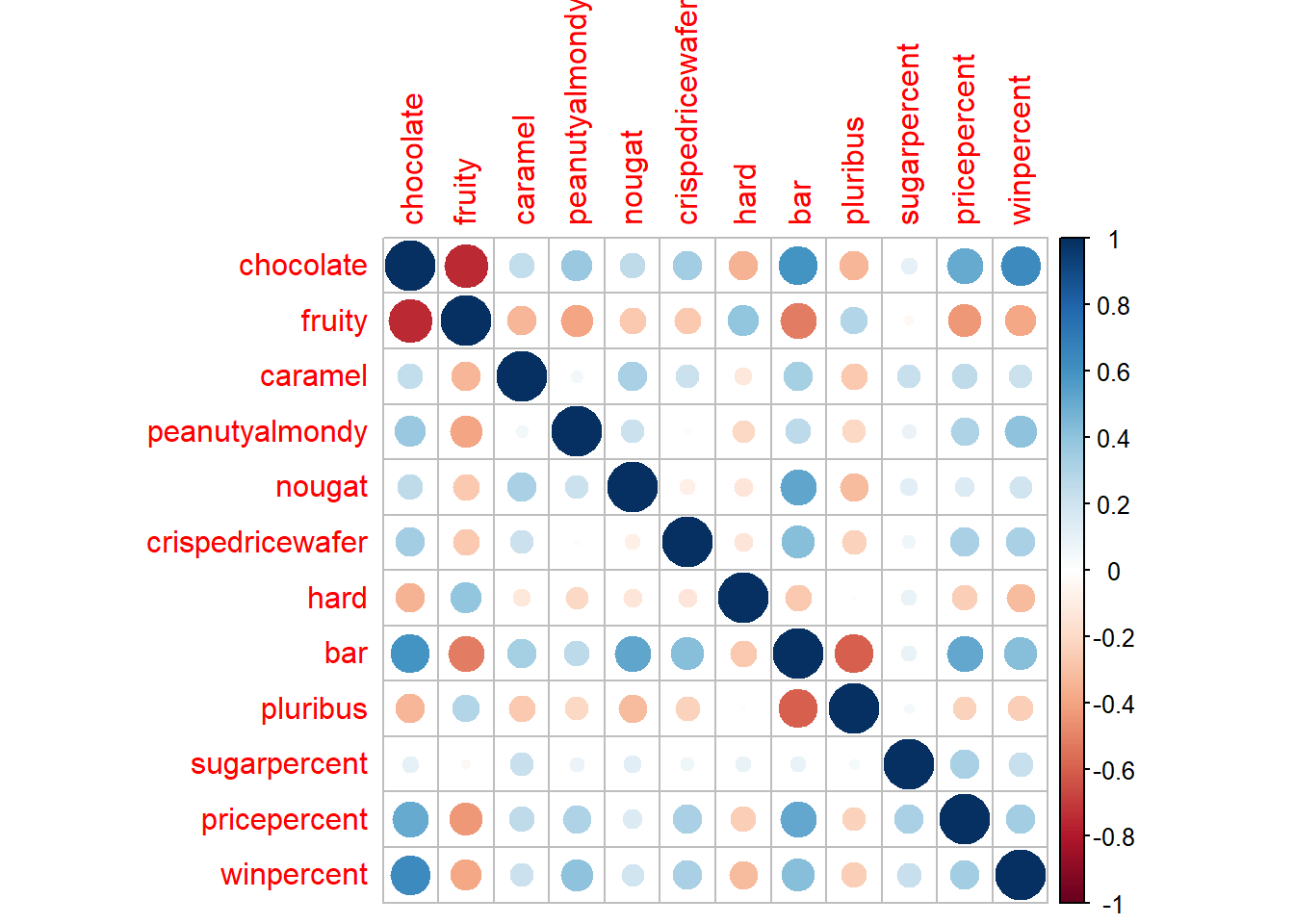
Q22. Examining this plot what two variables are anti-correlated (i.e. have minus values)?
- Fruity and Chocolate
Q23. Similarly, what two variables are most positively correlated?
- Variables plotted against themselves such as chocolate to chocolate
Principal Component Analysis
Let’s apply PCA using the prcomp() function to our candy data set while remembering to set the scale=TRUE argument.
pca <- prcomp(candy, scale=TRUE)
summary(pca)
Importance of components:
PC1 PC2 PC3 PC4 PC5 PC6 PC7
Standard deviation 2.0788 1.1378 1.1092 1.07533 0.9518 0.81923 0.81530
Proportion of Variance 0.3601 0.1079 0.1025 0.09636 0.0755 0.05593 0.05539
Cumulative Proportion 0.3601 0.4680 0.5705 0.66688 0.7424 0.79830 0.85369
PC8 PC9 PC10 PC11 PC12
Standard deviation 0.74530 0.67824 0.62349 0.43974 0.39760
Proportion of Variance 0.04629 0.03833 0.03239 0.01611 0.01317
Cumulative Proportion 0.89998 0.93832 0.97071 0.98683 1.00000plot(pca$x[,2], col=my_cols, pch=16)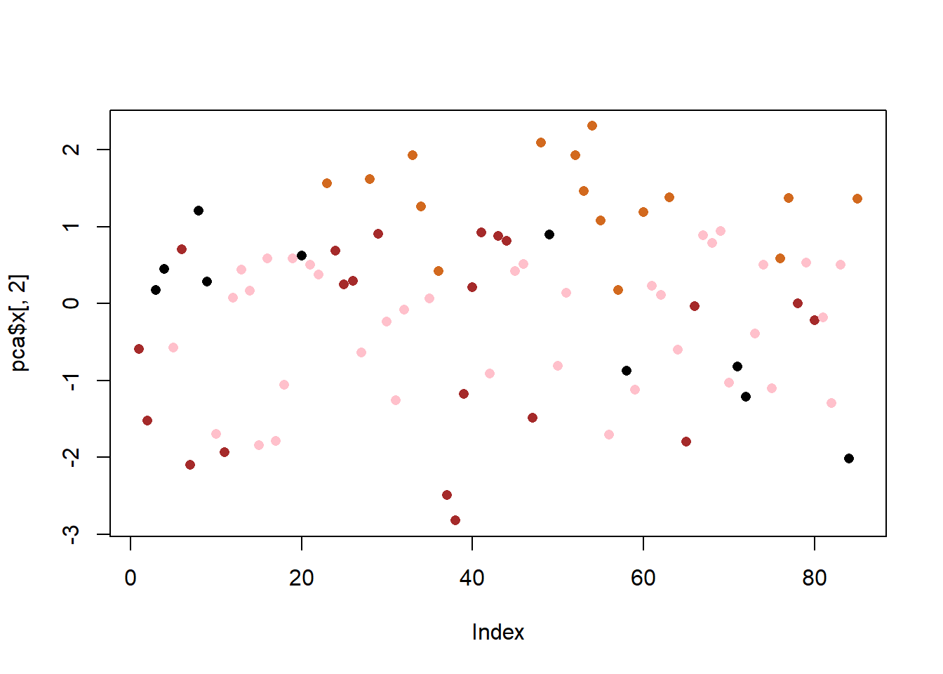
The main results figure: the PCA score plot”
ggplot(pca$x) +
  aes(PC1, PC2, label=row.names(pca$x)) +
  geom_point(col=my_cols) +
  geom_text_repel(col=my_cols) +
  labs(title="PCA Candy Space Map",
       subtitle="Separation of Candy Type") + ylab("PC2")
Warning: ggrepel: 27 unlabeled data points (too many overlaps). Consider
increasing max.overlaps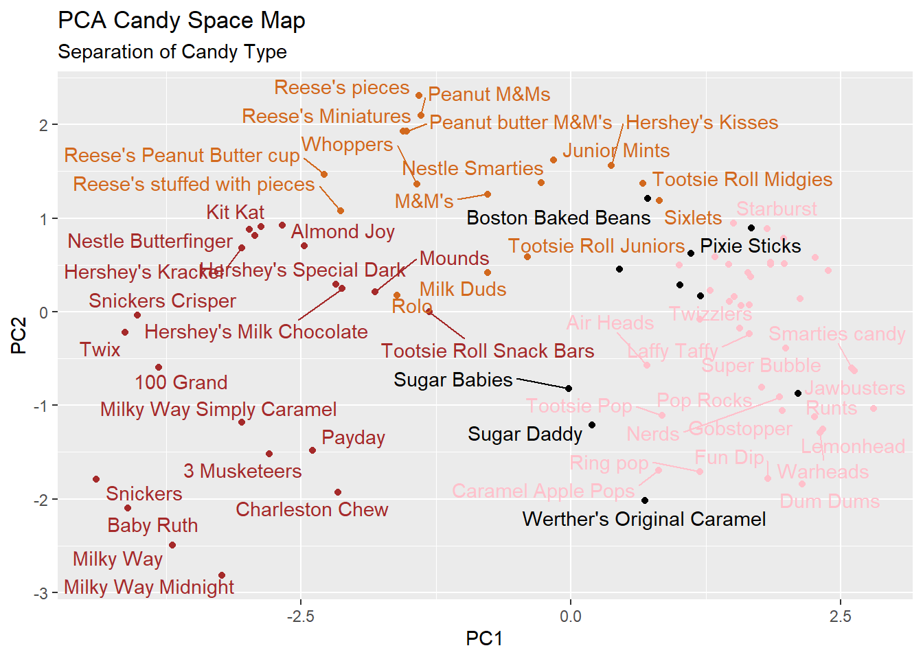
The “loadings” plot for PC1
ggplot(pca$rotation) +
  aes(PC1, reorder(rownames(pca$rotation), PC1)) +
  geom_col() + ylab("")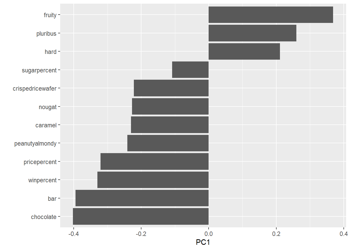
Q24. Complete the code to generate the loadings plot above. What original variables are picked up strongly by PC1 in the positive direction? Do these make sense to you? Where did you see this relationship highlighted previously?
- High contributions to PC1 is being pluribus, hard and fruity. This makes sense because the relationships were highlighted previously in the correlation plot. These variables on the correlation plot where the characteristics of hard and pluribus were the only two with positive correlation with being fruity. SO it makes sense that all three candy characteristics are grouped together and are picked up in the positive direction.
my_data <- cbind(candy, pca$x[,1:3])

p <-  ggplot(my_data) +
        aes(x=PC1, y=PC2,
            size=winpercent/100,
            text=rownames(my_data),
            label=rownames(my_data)) +
        geom_point(col=my_cols)
p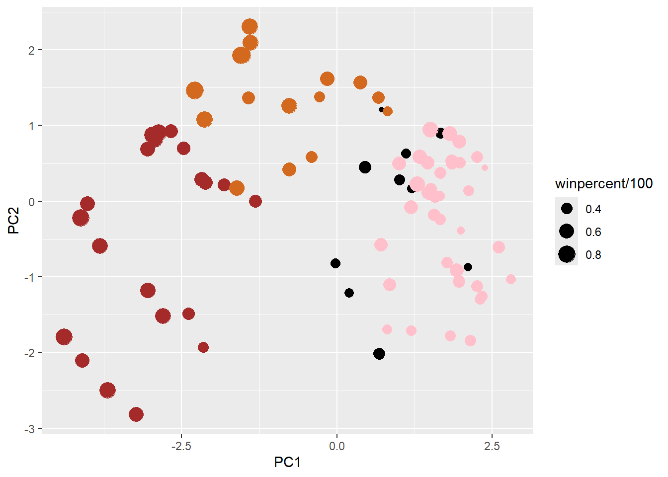
p + geom_text_repel(size=3.3, col=my_cols, max.overlaps = 7)  +
  theme(legend.position = "none") +
  labs(title="Halloween Candy PCA Space",
       subtitle="Colored by type: chocolate bar (dark brown), chocolate other (light brown), fruity (red), other (black)",
       caption="Data from 538")
Warning: ggrepel: 40 unlabeled data points (too many overlaps). Consider
increasing max.overlaps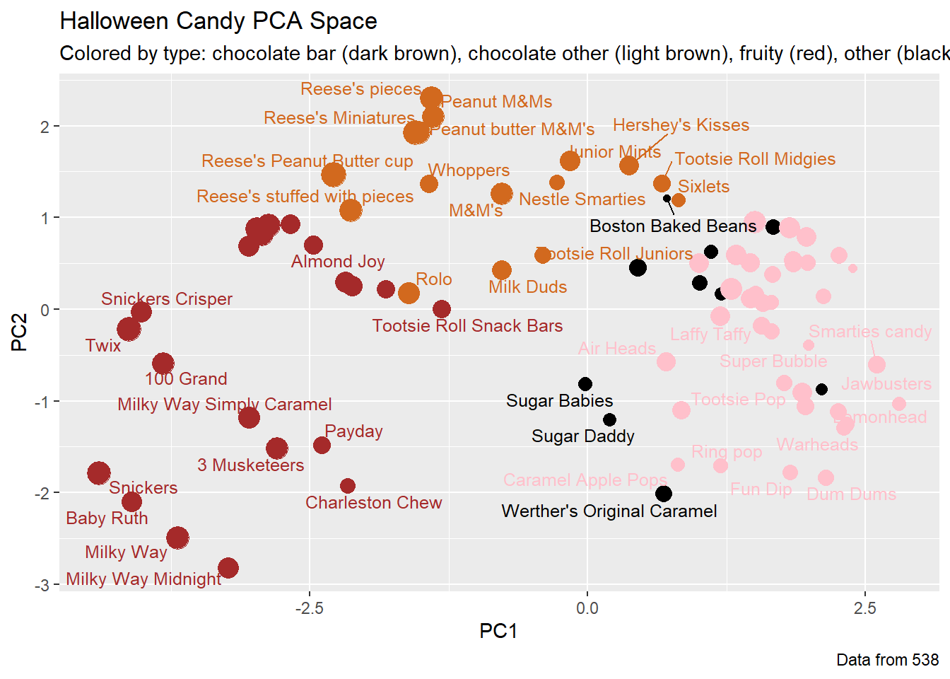
Summary
Q25. Based on your exploratory analysis, correlation findings, and PCA results, what combination of characteristics appears to make a “winning” candy? How do these different analyses (visualization, correlation, PCA) support or complement each other in reaching this conclusion?
- Being a bar and a chocolate appears to make a “winning” candy. In the bar ggplot visualization (Q16), the most popular candies are the chocolates and those that are bars. The scatter plot visualization made in the “Taking a look at pricepercent” section shows that the chocolate candies and the bar candies have the highest win percent, further showing that those candies have a higher chance of being chosen over a random piece of candy. The correlation structure shows that if the candy is chocolate, then it a has a higher positive correlation of between 0.6 and 0.8 with being a bar candy and having high win percent. The “loadings” plot further supports that, at this point, being a chocolate candy and a bar candy makes a “winning” candy because those are the two most contributing variables to PC1. Thus, the different analyzes complement each other in reaching this conclusion by narrowing down the greater contributing factors. The visualizations give a brief overview on what actual variables, such as candy bars, are popular or stand out. The correlation plot shows how the combinations making up each variable are correlated or how they interact with each other. The PCA then narrows down which specific factors of the combination contributes greatly to the variable of interest.