counts <- read.csv("airway_scaledcounts.csv", row.names = 1)
metadata <- read.csv("airway_metadata.csv")Class 13: RNASeq with DESeq2
Background
Today we will perform an RNASeq analysis on the effects of dexamethasone (hereafter “dex”), a common steroid, on airway smooth muscle (ASM) cell lines.
Data Import
We need two things for this analysis:
- countData: a table with genes as rows and samples/experiments as columns
- colData: metadata about the columns (i.e. samples) in the main countData object
Let’s have a peak at these two objects:
metadata id dex celltype geo_id
1 SRR1039508 control N61311 GSM1275862
2 SRR1039509 treated N61311 GSM1275863
3 SRR1039512 control N052611 GSM1275866
4 SRR1039513 treated N052611 GSM1275867
5 SRR1039516 control N080611 GSM1275870
6 SRR1039517 treated N080611 GSM1275871
7 SRR1039520 control N061011 GSM1275874
8 SRR1039521 treated N061011 GSM1275875head(counts) SRR1039508 SRR1039509 SRR1039512 SRR1039513 SRR1039516
ENSG00000000003 723 486 904 445 1170
ENSG00000000005 0 0 0 0 0
ENSG00000000419 467 523 616 371 582
ENSG00000000457 347 258 364 237 318
ENSG00000000460 96 81 73 66 118
ENSG00000000938 0 0 1 0 2
SRR1039517 SRR1039520 SRR1039521
ENSG00000000003 1097 806 604
ENSG00000000005 0 0 0
ENSG00000000419 781 417 509
ENSG00000000457 447 330 324
ENSG00000000460 94 102 74
ENSG00000000938 0 0 0Check on metadata counts coresspondance
We need to check that the metadata matches the samples in the count data.
ncol(counts) == nrow(metadata)[1] TRUEcolnames(counts) == metadata$id[1] TRUE TRUE TRUE TRUE TRUE TRUE TRUE TRUEQ1. How many genes are in this dataset
nrow(counts)[1] 38694Q2. How many “control” samples are in this dataset
sum(metadata$dex == "control")[1] 4Analysis Plan
We have 4 replicates per condition (“control” and “treated”). We want to compare the control vs the treated to see which genes expression levels change when we have the drug present.
“We are going row by row (gene by gene) and seeing if the average value in the control column is different than the average value in the treated columns”
- Step 1. Find which columns in
countscorrespond to “control” samples
# The indices (i.e. positions) that are "control"
control.inds <- metadata$dex == "control"- Step 2. Extract/select the “control” columns
# Extract/select these "control" columns from counts
control.counts <- counts[,control.inds]- Step 3. Calculate an average value for each gene (i.e. each row)
# Calculate the mean for each gene (i.e row)
control.means <- rowMeans(control.counts)
Q. Do the same for “treated” samples - find the mean count value per gene
treated.inds <- metadata$dex == "treated"
treated.counts <- counts[,treated.inds]
treated.means <- rowMeans(treated.counts)- Can also be done this way:
# rowMeans(counts[ , metadata$dex == "treated"])Let’s put these two mean values into a new data.frame meancounts for easy book-keeping and plotting
meancounts <- data.frame(control.means, treated.means)
head(meancounts)
control.means treated.means
ENSG00000000003 900.75 658.00
ENSG00000000005 0.00 0.00
ENSG00000000419 520.50 546.00
ENSG00000000457 339.75 316.50
ENSG00000000460 97.25 78.75
ENSG00000000938 0.75 0.00Q. Make a ggplot of average counts of control vs treated
The plot below wants to be log transformed because it is highly skewed
library(ggplot2)
ggplot(meancounts) +
  aes(control.means, treated.means) +
geom_point(alpha=0.3) 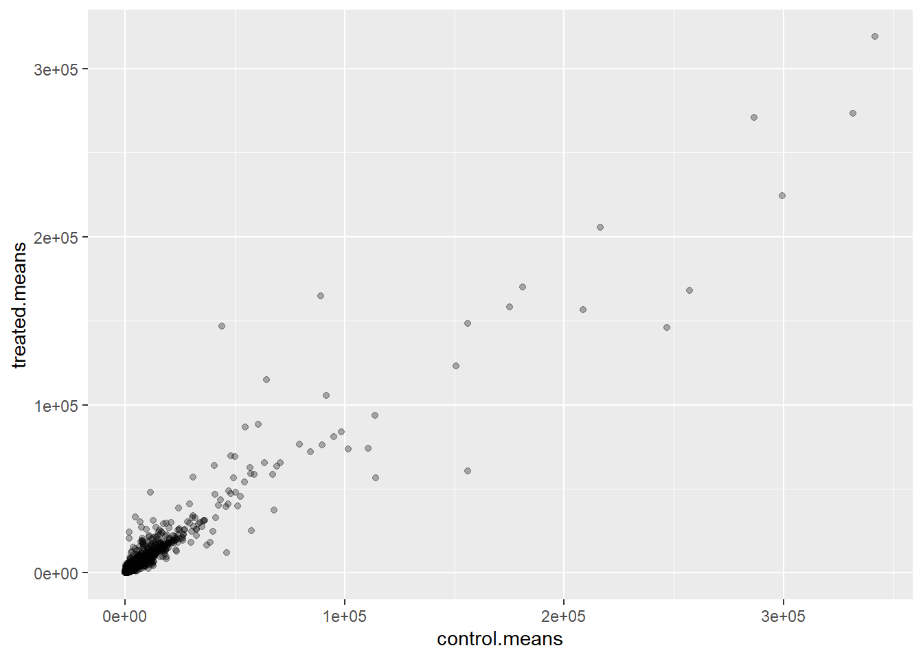
ggplot(meancounts) +
  aes(control.means, treated.means) +
  geom_point(alpha=0.3) +
  scale_x_log10() +
  scale_y_log10()
Warning in scale_x_log10(): log-10 transformation introduced infinite values.Warning in scale_y_log10(): log-10 transformation introduced infinite values.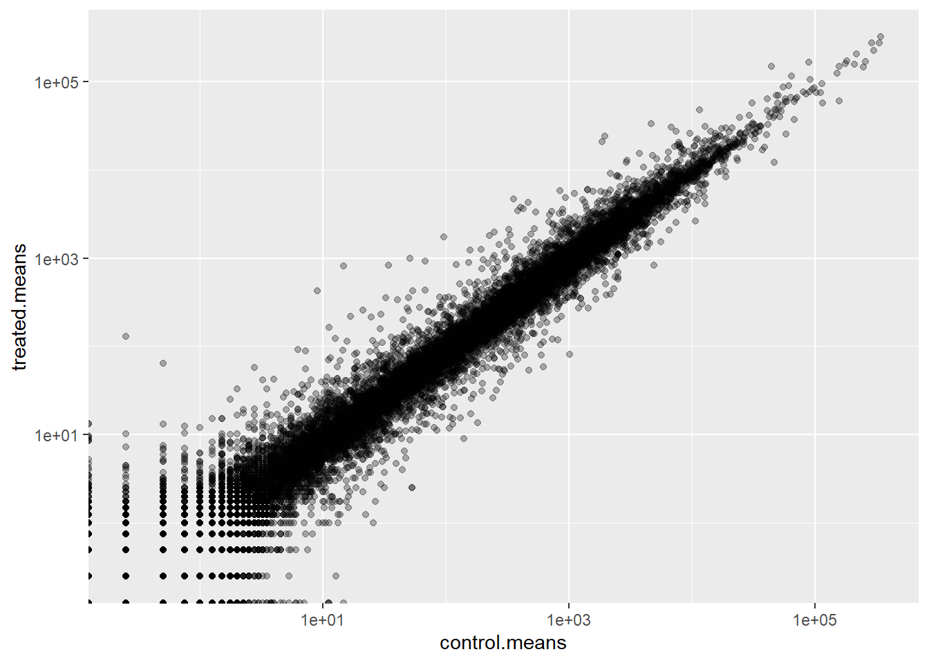
Log2 units and fold change
If we consider “treated”/“control” counts, we will get a number that tells us the change. Log2 units show which direction the line is going based on positive and negative sign, and it shows the magnitude
20/20[1] 1# No change because value is 0
log2(20/20)[1] 040/20[1] 2# A doubling in the treated vs control + positive value/higher than one is upregulation by 4
log2(40/20)[1] 110/20[1] 0.5# Sign is flipped + less than 1/negative value is downregulation by 4
log(10/20)[1] -0.6931472Q. Add a new column
log2fcfor log2 fold change of treate/control to ourmeancountsobject
meancounts$log2fc <-
  log2(meancounts$treated.means/
         meancounts$control.means)

head(meancounts)
control.means treated.means log2fc
ENSG00000000003 900.75 658.00 -0.45303916
ENSG00000000005 0.00 0.00 NaN
ENSG00000000419 520.50 546.00 0.06900279
ENSG00000000457 339.75 316.50 -0.10226805
ENSG00000000460 97.25 78.75 -0.30441833
ENSG00000000938 0.75 0.00 -InfRemove Zero Count Genes
Typically, we would not consider zero count genes - as we have no data about them and they should be excluded from further consideration. These lead to “funky” log2 fold change values (e.g. divide by zero errors etc.)
DESeq Analysis
We are missing any measure of significance from hte work we have so far. Let’s do this properly with the DESeq2 package.
library(DESeq2)The DESeq2 package, like many bioconductor packages, wants it’s input in a very specific way - a data structure setup with all the info it needs for the calculation.
dds <- DESeqDataSetFromMatrix(countData = counts,
                       colData = metadata,
                       design = ~dex)
converting counts to integer modeWarning in DESeqDataSet(se, design = design, ignoreRank): some variables in
design formula are characters, converting to factorsThe main function in this package is called DESeq() it will run the full analysis for us on our dds input object:
dds <- DESeq(dds)estimating size factorsestimating dispersionsgene-wise dispersion estimatesmean-dispersion relationshipfinal dispersion estimatesfitting model and testingExtract our results
res <- results(dds)
head(res)
log2 fold change (MLE): dex treated vs control
Wald test p-value: dex treated vs control
DataFrame with 6 rows and 6 columns
baseMean log2FoldChange lfcSE stat pvalue
<numeric> <numeric> <numeric> <numeric> <numeric>
ENSG00000000003 747.194195 -0.3507030 0.168246 -2.084470 0.0371175
ENSG00000000005 0.000000 NA NA NA NA
ENSG00000000419 520.134160 0.2061078 0.101059 2.039475 0.0414026
ENSG00000000457 322.664844 0.0245269 0.145145 0.168982 0.8658106
ENSG00000000460 87.682625 -0.1471420 0.257007 -0.572521 0.5669691
ENSG00000000938 0.319167 -1.7322890 3.493601 -0.495846 0.6200029
padj
<numeric>
ENSG00000000003 0.163035
ENSG00000000005 NA
ENSG00000000419 0.176032
ENSG00000000457 0.961694
ENSG00000000460 0.815849
ENSG00000000938 NAVolcano Plot
A useful summary figure of our results is often called a volcano plot. It is basically a plot of log2 fold change values vs the adjusted p values.
Q. Use ggplot to make a first version “volcano plot” of
log2FoldChangevspadj
ggplot(res) +
  aes(log2FoldChange, padj) +
  geom_point()
Warning: Removed 23549 rows containing missing values or values outside the scale range
(`geom_point()`).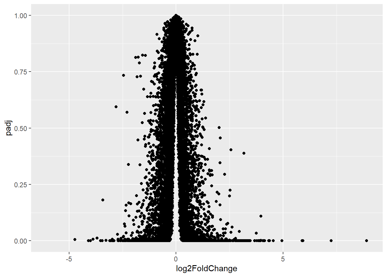
The graph above is not very useful because the y-axis (p-value) is not really helpful - we want to focus on low P-values
ggplot(res) +
  aes(log2FoldChange, log(padj)) +
  geom_point()
Warning: Removed 23549 rows containing missing values or values outside the scale range
(`geom_point()`).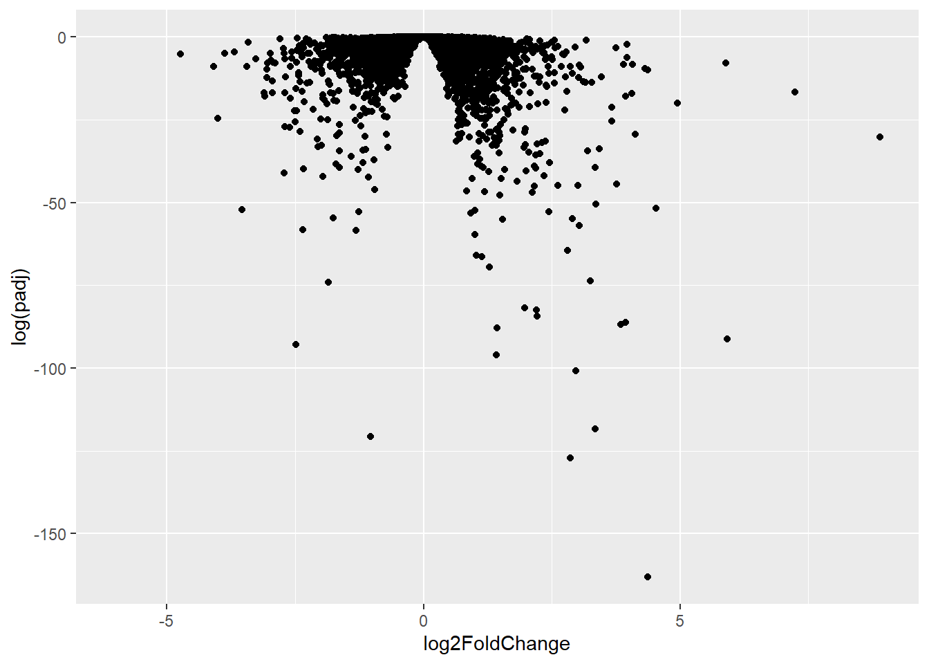
ggplot(res) +
  aes(log2FoldChange, -log(padj)) +
  geom_point() +
  geom_vline(xintercept = c(-2,+2), col="red") +
  geom_hline(yintercept = -log(0.05), col="red")
Warning: Removed 23549 rows containing missing values or values outside the scale range
(`geom_point()`).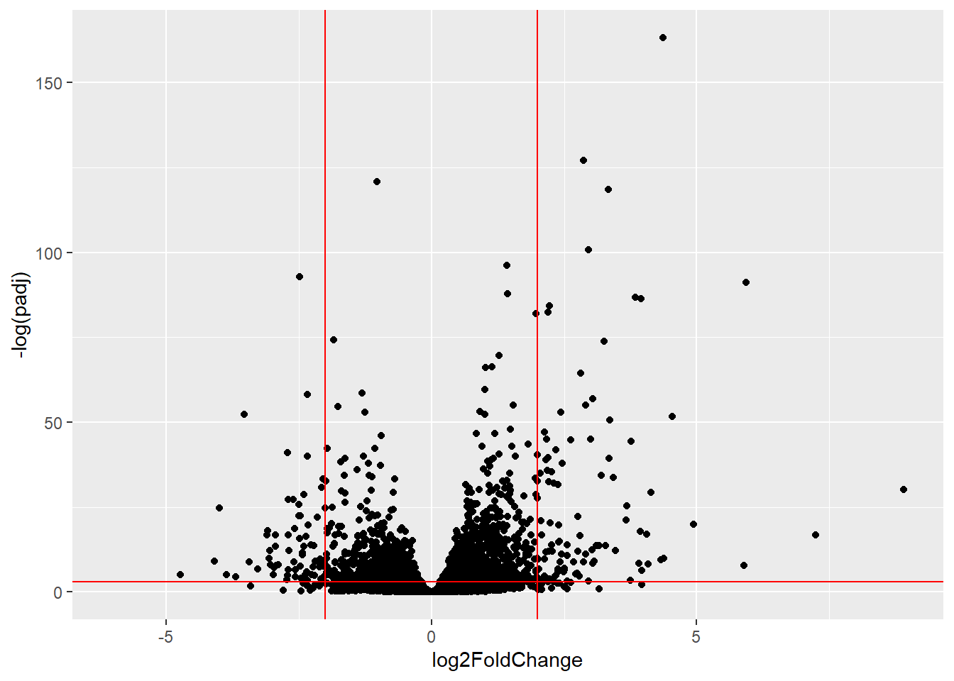
Add some plot annotation
Q. Add color to the points (genes) we care about, nice axis labels, and useful title and a nice theme
mycols <- rep("gray", nrow(res))
mycols[res$log2FoldChange > 2] <- "blue"
mycols[res$log2FoldChange < -2] <- "darkgreen"
mycols[res$padj >= 0.05] <-  "gray"

ggplot(res) +
  aes(x = log2FoldChange,
      y = -log(padj),) +
  geom_point(col=mycols) +
  geom_vline(xintercept = c(-2,+2), col="red") +
  geom_hline(yintercept = -log(0.05), col="red") +
  ylab("log(Adjusted P-value)") + xlab("log(Fold Change)") +
  labs(title="Effects of Dex Data in Relation to Gene Expression") +
  theme_classic()
Warning: Removed 23549 rows containing missing values or values outside the scale range
(`geom_point()`).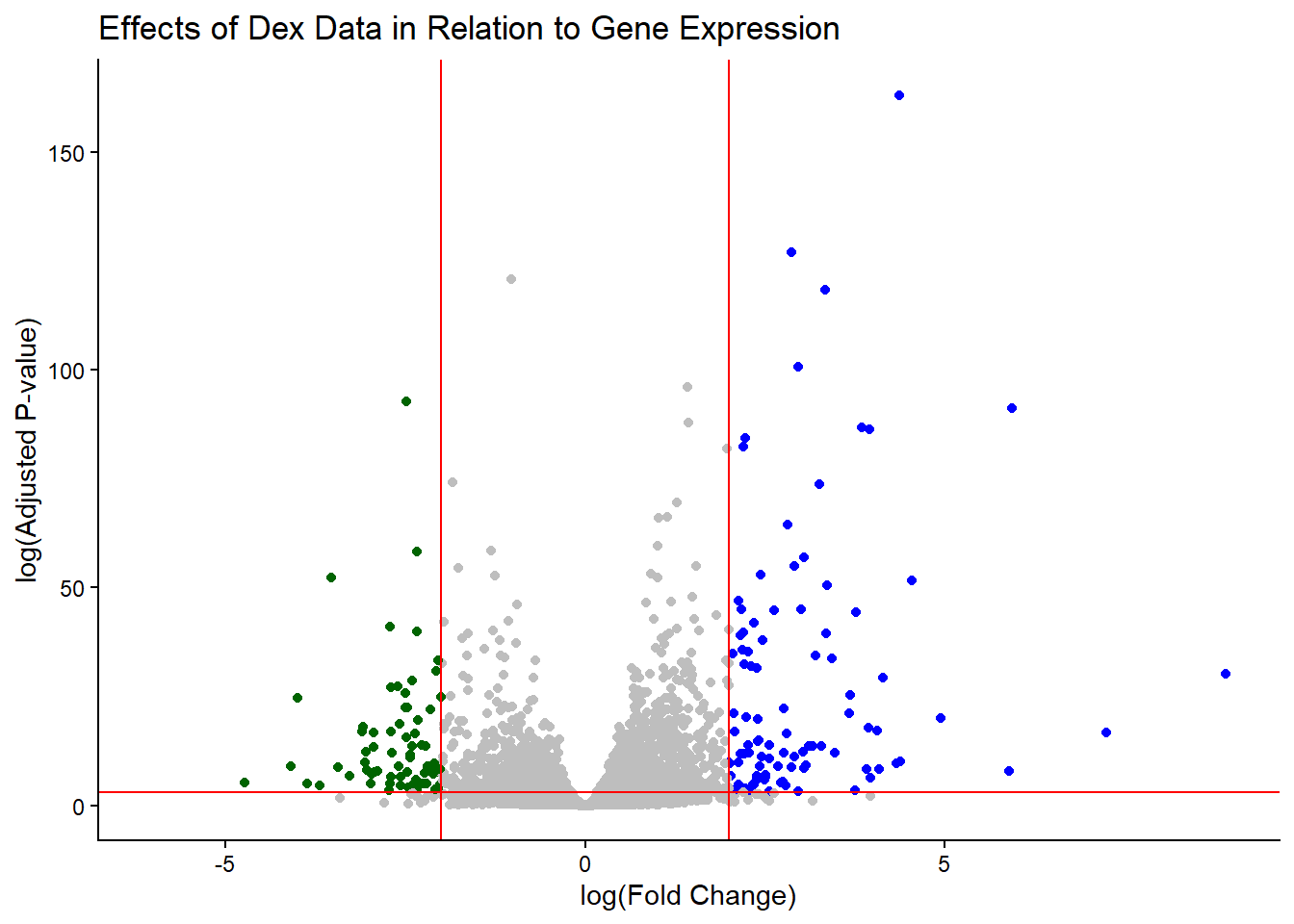
Save our results to a CSV file
write.csv(res, file="results.csv")Add Annotation Data
To make sense of our results we need to know what the differentially expressed genes are and what biological pathways and process they are involved in
head(res)log2 fold change (MLE): dex treated vs control
Wald test p-value: dex treated vs control
DataFrame with 6 rows and 6 columns
baseMean log2FoldChange lfcSE stat pvalue
<numeric> <numeric> <numeric> <numeric> <numeric>
ENSG00000000003 747.194195 -0.3507030 0.168246 -2.084470 0.0371175
ENSG00000000005 0.000000 NA NA NA NA
ENSG00000000419 520.134160 0.2061078 0.101059 2.039475 0.0414026
ENSG00000000457 322.664844 0.0245269 0.145145 0.168982 0.8658106
ENSG00000000460 87.682625 -0.1471420 0.257007 -0.572521 0.5669691
ENSG00000000938 0.319167 -1.7322890 3.493601 -0.495846 0.6200029
padj
<numeric>
ENSG00000000003 0.163035
ENSG00000000005 NA
ENSG00000000419 0.176032
ENSG00000000457 0.961694
ENSG00000000460 0.815849
ENSG00000000938 NALet’s start by mapping our ENSEMBLE ids to the more conventional gene SYMBOL.
We will use two bioconductor packages for this “mapping”: AnnotationDbi and org.Hs.eg.db
We will first need to install these from bioconductor with BiocManager::install("")
library(AnnotationDbi)
library(org.Hs.eg.db)columns(org.Hs.eg.db) [1] "ACCNUM" "ALIAS" "ENSEMBL" "ENSEMBLPROT" "ENSEMBLTRANS"
[6] "ENTREZID" "ENZYME" "EVIDENCE" "EVIDENCEALL" "GENENAME"
[11] "GENETYPE" "GO" "GOALL" "IPI" "MAP"
[16] "OMIM" "ONTOLOGY" "ONTOLOGYALL" "PATH" "PFAM"
[21] "PMID" "PROSITE" "REFSEQ" "SYMBOL" "UCSCKG"
[26] "UNIPROT" res$symbol <- mapIds(org.Hs.eg.db,
keys = rownames(res), # Our ENSEMBLE ids
keytype = "ENSEMBL", # Their format
column = "SYMBOL") # What I want to translate to 'select()' returned 1:many mapping between keys and columnshead(res)log2 fold change (MLE): dex treated vs control
Wald test p-value: dex treated vs control
DataFrame with 6 rows and 7 columns
baseMean log2FoldChange lfcSE stat pvalue
<numeric> <numeric> <numeric> <numeric> <numeric>
ENSG00000000003 747.194195 -0.3507030 0.168246 -2.084470 0.0371175
ENSG00000000005 0.000000 NA NA NA NA
ENSG00000000419 520.134160 0.2061078 0.101059 2.039475 0.0414026
ENSG00000000457 322.664844 0.0245269 0.145145 0.168982 0.8658106
ENSG00000000460 87.682625 -0.1471420 0.257007 -0.572521 0.5669691
ENSG00000000938 0.319167 -1.7322890 3.493601 -0.495846 0.6200029
padj symbol
<numeric> <character>
ENSG00000000003 0.163035 TSPAN6
ENSG00000000005 NA TNMD
ENSG00000000419 0.176032 DPM1
ENSG00000000457 0.961694 SCYL3
ENSG00000000460 0.815849 FIRRM
ENSG00000000938 NA FGRQ. Can you add “GENENAME” and “ENTREZID” as new columns to
resnamed “name” and “entrez”
res$name <- mapIds(org.Hs.eg.db,
               keys = rownames(res),
               keytype = "ENSEMBL",
               column = "GENENAME")
'select()' returned 1:many mapping between keys and columnsres$entrez <- mapIds(org.Hs.eg.db,
keys = rownames(res),
keytype = "ENSEMBL",
column = "ENTREZID") 'select()' returned 1:many mapping between keys and columnshead(res)log2 fold change (MLE): dex treated vs control
Wald test p-value: dex treated vs control
DataFrame with 6 rows and 9 columns
baseMean log2FoldChange lfcSE stat pvalue
<numeric> <numeric> <numeric> <numeric> <numeric>
ENSG00000000003 747.194195 -0.3507030 0.168246 -2.084470 0.0371175
ENSG00000000005 0.000000 NA NA NA NA
ENSG00000000419 520.134160 0.2061078 0.101059 2.039475 0.0414026
ENSG00000000457 322.664844 0.0245269 0.145145 0.168982 0.8658106
ENSG00000000460 87.682625 -0.1471420 0.257007 -0.572521 0.5669691
ENSG00000000938 0.319167 -1.7322890 3.493601 -0.495846 0.6200029
padj symbol name entrez
<numeric> <character> <character> <character>
ENSG00000000003 0.163035 TSPAN6 tetraspanin 6 7105
ENSG00000000005 NA TNMD tenomodulin 64102
ENSG00000000419 0.176032 DPM1 dolichyl-phosphate m.. 8813
ENSG00000000457 0.961694 SCYL3 SCY1 like pseudokina.. 57147
ENSG00000000460 0.815849 FIRRM FIGNL1 interacting r.. 55732
ENSG00000000938 NA FGR FGR proto-oncogene, .. 2268write.csv(res, file="results_annotated.csv")Pathway analysis
Now we now the gene names (gene symbols) and their entrez IDs, we can find out what pathways they are involved in. This is called “pathway analysis” or “gene set enrichment”
We will use the gage package and the pathviewer package to do this analysis (but there are loads of others).
library(gage)
library(gageData)
library(pathview)
Let’s see what is in gageData, specifically KEGG pathways:
data("kegg.sets.hs")
head(kegg.sets.hs, 2)
$`hsa00232 Caffeine metabolism`
[1] "10" "1544" "1548" "1549" "1553" "7498" "9"
$`hsa00983 Drug metabolism - other enzymes`
[1] "10" "1066" "10720" "10941" "151531" "1548" "1549" "1551"
[9] "1553" "1576" "1577" "1806" "1807" "1890" "221223" "2990"
[17] "3251" "3614" "3615" "3704" "51733" "54490" "54575" "54576"
[25] "54577" "54578" "54579" "54600" "54657" "54658" "54659" "54963"
[33] "574537" "64816" "7083" "7084" "7172" "7363" "7364" "7365"
[41] "7366" "7367" "7371" "7372" "7378" "7498" "79799" "83549"
[49] "8824" "8833" "9" "978" To run our pathway analysis, we will use the gage() function. It wants two main required inputs: a vector of importance (in our case the log2 fold change values); and the gene sets to check overlap for.
foldchanges <- res$log2FoldChange
names(foldchanges) <- res$symbol
head(foldchanges)
TSPAN6 TNMD DPM1 SCYL3 FIRRM FGR
-0.35070302 NA 0.20610777 0.02452695 -0.14714205 -1.73228897 KEGG speaks entrez (i.e. uses ENTREZID format) not gene symbol format
names(foldchanges) <- res$entrezkeggres = gage(foldchanges, gsets=kegg.sets.hs)head(keggres$less, 5) p.geomean stat.mean
hsa05332 Graft-versus-host disease 0.0004250461 -3.473346
hsa04940 Type I diabetes mellitus 0.0017820293 -3.002352
hsa05310 Asthma 0.0020045888 -3.009050
hsa04672 Intestinal immune network for IgA production 0.0060434515 -2.560547
hsa05330 Allograft rejection 0.0073678825 -2.501419
p.val q.val
hsa05332 Graft-versus-host disease 0.0004250461 0.09053483
hsa04940 Type I diabetes mellitus 0.0017820293 0.14232581
hsa05310 Asthma 0.0020045888 0.14232581
hsa04672 Intestinal immune network for IgA production 0.0060434515 0.31387180
hsa05330 Allograft rejection 0.0073678825 0.31387180
set.size exp1
hsa05332 Graft-versus-host disease 40 0.0004250461
hsa04940 Type I diabetes mellitus 42 0.0017820293
hsa05310 Asthma 29 0.0020045888
hsa04672 Intestinal immune network for IgA production 47 0.0060434515
hsa05330 Allograft rejection 36 0.0073678825Let’s make a figure of one of these pathways with our DEGs highlighted:
pathview(foldchanges, pathway.id = "hsa05310")'select()' returned 1:1 mapping between keys and columnsInfo: Working in directory C:/Users/jaqui/OneDrive/Desktop/BIMM143R_Studio/Class 13Info: Writing image file hsa05310.pathview.png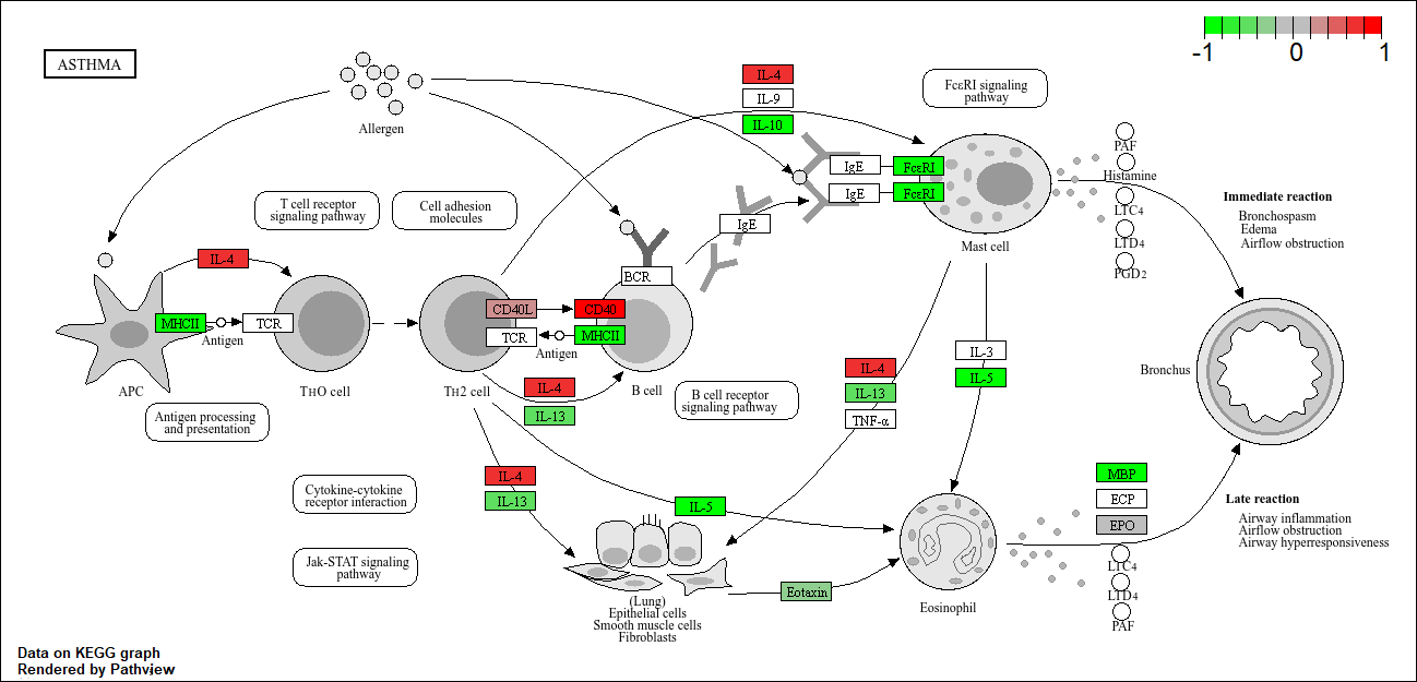
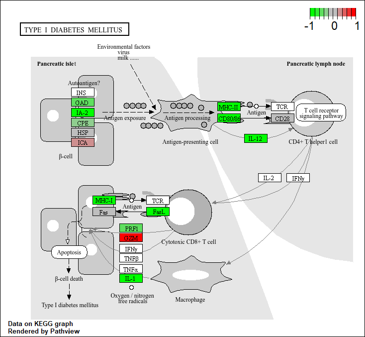
Q. Generate and insert a pathway figure for “Graft-versus-host disease” and “Type I disease”
pathview(foldchanges, pathway.id = "hsa05332") #Graft-versus-host disease'select()' returned 1:1 mapping between keys and columnsInfo: Working in directory C:/Users/jaqui/OneDrive/Desktop/BIMM143R_Studio/Class 13Info: Writing image file hsa05332.pathview.png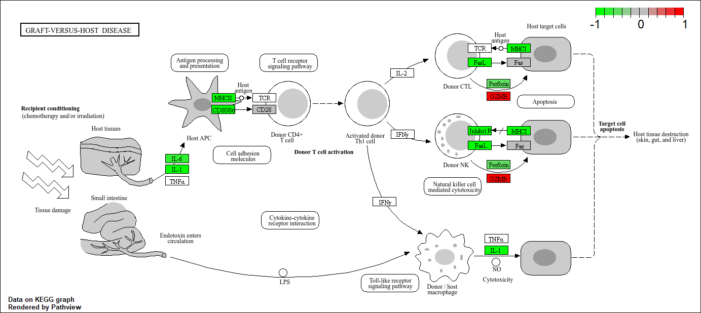
pathview(foldchanges, pathway.id = "hsa04940") #Type I disease'select()' returned 1:1 mapping between keys and columnsInfo: Working in directory C:/Users/jaqui/OneDrive/Desktop/BIMM143R_Studio/Class 13Info: Writing image file hsa04940.pathview.png