cdc <- data.frame(
                                 year = c(1922L,1923L,1924L,1925L,
                                          1926L,1927L,1928L,1929L,1930L,1931L,
                                          1932L,1933L,1934L,1935L,1936L,
                                          1937L,1938L,1939L,1940L,1941L,1942L,
                                          1943L,1944L,1945L,1946L,1947L,
                                          1948L,1949L,1950L,1951L,1952L,
                                          1953L,1954L,1955L,1956L,1957L,1958L,
                                          1959L,1960L,1961L,1962L,1963L,
                                          1964L,1965L,1966L,1967L,1968L,1969L,
                                          1970L,1971L,1972L,1973L,1974L,
                                          1975L,1976L,1977L,1978L,1979L,1980L,
                                          1981L,1982L,1983L,1984L,1985L,
                                          1986L,1987L,1988L,1989L,1990L,
                                          1991L,1992L,1993L,1994L,1995L,1996L,
                                          1997L,1998L,1999L,2000L,2001L,
                                          2002L,2003L,2004L,2005L,2006L,2007L,
                                          2008L,2009L,2010L,2011L,2012L,
                                          2013L,2014L,2015L,2016L,2017L,2018L,
                                          2019L,2020L,2021L,2022L,2023L,2024L,2025L),
                                cases = c(107473,164191,165418,152003,
                                          202210,181411,161799,197371,
                                          166914,172559,215343,179135,265269,
                                          180518,147237,214652,227319,103188,
                                          183866,222202,191383,191890,109873,
                                          133792,109860,156517,74715,69479,
                                          120718,68687,45030,37129,60886,
                                          62786,31732,28295,32148,40005,
                                          14809,11468,17749,17135,13005,6799,
                                          7717,9718,4810,3285,4249,3036,
                                          3287,1759,2402,1738,1010,2177,2063,
                                          1623,1730,1248,1895,2463,2276,
                                          3589,4195,2823,3450,4157,4570,
                                          2719,4083,6586,4617,5137,7796,6564,
                                          7405,7298,7867,7580,9771,11647,
                                          25827,25616,15632,10454,13278,
                                          16858,27550,18719,48277,28639,32971,
                                          20762,17972,18975,15609,18617,
                                          6124,2116,3044,7063,22538,21996)
)Class18: Pertussis Mini-Project
Background
Pertussis (a.k.a. whooping cough) is a common lung infection caused by the bacteria B.Petussis
This can infect people of any age, but it is most severe and most deadly for those under 1 year of age.
Because of its seriousness, the CDC tracks the number of reported cases in the U.S.
We can “scrape” this data with the datapasta package
Q1. Make a plot of year vs cases
library(ggplot2)

ggplot(cdc) +
  aes(year, cases) +
  geom_point() +
  geom_line()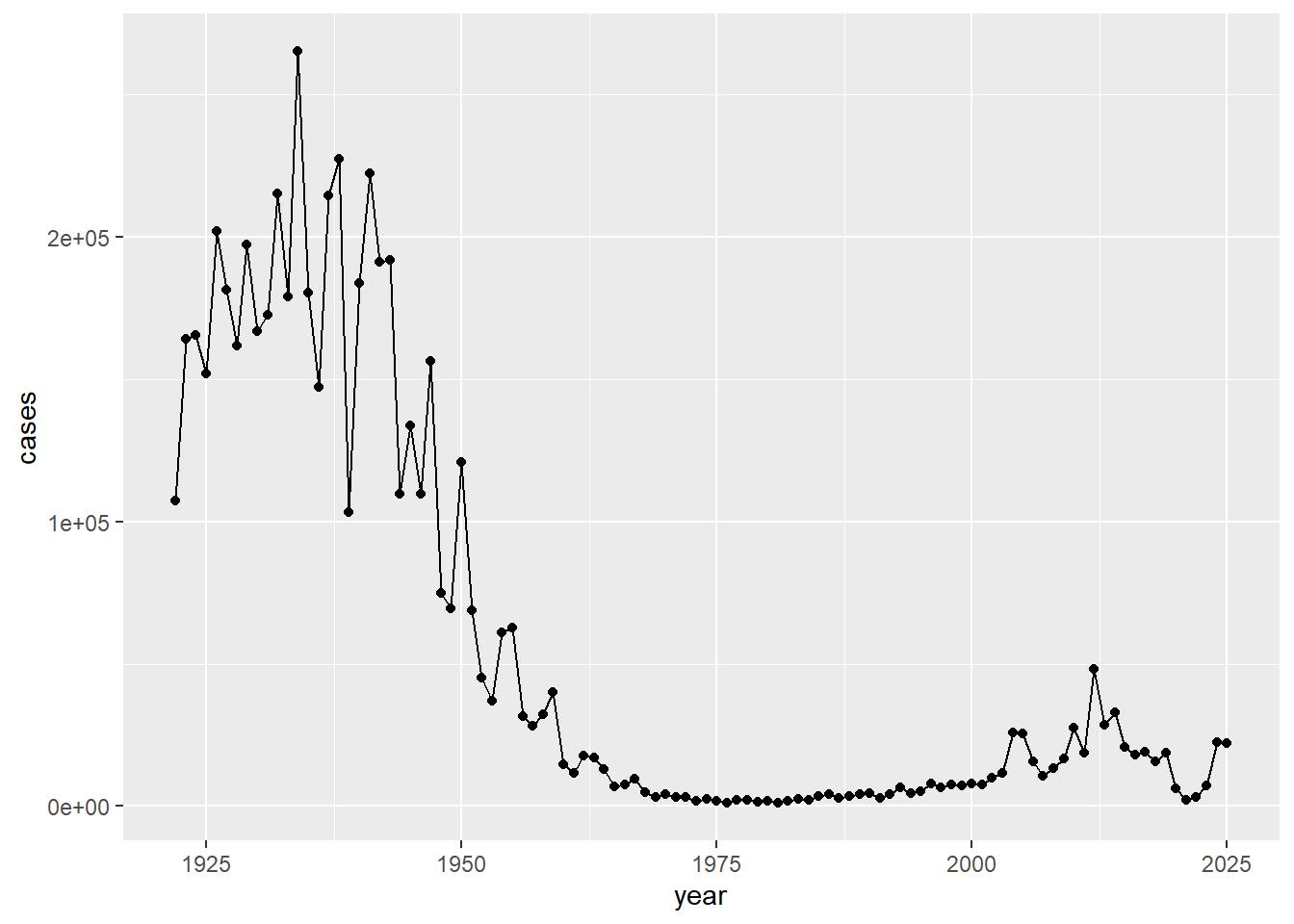
Q2. Add some major milestones including the first wP vaccine rollout (1946), the switch to the newer aP vaccine (1996), and the COVID years (2020)
ggplot(cdc) +
  aes(year, cases) +
  geom_point() +
  geom_line() +
  geom_vline(xintercept = 1946, col="blue", linetype="dashed") +
  geom_vline(xintercept = 1996, col="red", linetype="dashed") +
  geom_vline(xintercept = 2020, col="darkgreen", linetype="dashed")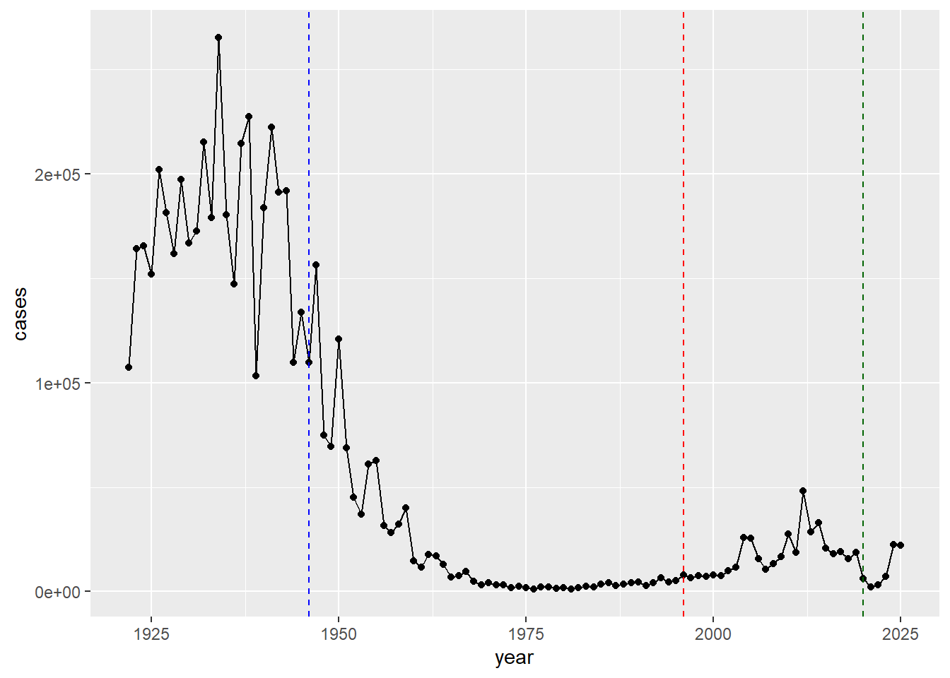
- There were high case numbers in the pre-1940s, then the numbers significantly decreased going into the 1950s, 1960s, 1970s, and before the 2000s. The numbers started increasing again after 1996, likely due to not getting booster vaccines allowing the disease to still spread need to lengthen the longevity of the aP vaccine. This suggests that the protection from the aP vaccine wanes faster than that of the wP vaccine.
Why is this vaccine-preventable disease on the upswing? To answer this question we need to investigate the mechanisms underlying waning protection against pertussis. This requires evaluation of pertussis-specific immune responses over time in wP and aP vaccinated individuals.
CMI-PB Project
Computational Models of Immunity - Pertussis Boost project aims to provide the scientific community with this very information
They make their data available via JSON format returning API. We can read this in R with the read_json() function from the jsonlite package:
library(jsonlite)

subject <- read_json("http://cmi-pb.org/api/v5_1/subject", TRUE)

head(subject)
subject_id infancy_vac biological_sex ethnicity race
1 1 wP Female Not Hispanic or Latino White
2 2 wP Female Not Hispanic or Latino White
3 3 wP Female Unknown White
4 4 wP Male Not Hispanic or Latino Asian
5 5 wP Male Not Hispanic or Latino Asian
6 6 wP Female Not Hispanic or Latino White
year_of_birth date_of_boost dataset
1 1986-01-01 2016-09-12 2020_dataset
2 1968-01-01 2019-01-28 2020_dataset
3 1983-01-01 2016-10-10 2020_dataset
4 1988-01-01 2016-08-29 2020_dataset
5 1991-01-01 2016-08-29 2020_dataset
6 1988-01-01 2016-10-10 2020_datasetQ. How many wP and aP individuals are in this table
table(subject$infancy_vac)
aP wP
87 85
Q. What is the breakdown of the biological sex
table(subject$biological_sex)
Female   Male
   112     60
Q. In terms of race and gender, is this dataset representative of the U.S. population
table(subject$race, subject$biological_sex)
                                            Female Male
  American Indian/Alaska Native                  0    1
  Asian                                         32   12
  Black or African American                      2    3
  More Than One Race                            15    4
  Native Hawaiian or Other Pacific Islander      1    1
  Unknown or Not Reported                       14    7
  White                                         48   32
Let’s read some more database tables
specimen <- read_json("http://cmi-pb.org/api/v5_1/specimen", TRUE)
ab_titer <- read_json("http://cmi-pb.org/api/v5_1/plasma_ab_titer", TRUE)head(specimen) specimen_id subject_id actual_day_relative_to_boost
1 1 1 -3
2 2 1 1
3 3 1 3
4 4 1 7
5 5 1 11
6 6 1 32
planned_day_relative_to_boost specimen_type visit
1 0 Blood 1
2 1 Blood 2
3 3 Blood 3
4 7 Blood 4
5 14 Blood 5
6 30 Blood 6head(ab_titer) specimen_id isotype is_antigen_specific antigen MFI MFI_normalised
1 1 IgE FALSE Total 1110.21154 2.493425
2 1 IgE FALSE Total 2708.91616 2.493425
3 1 IgG TRUE PT 68.56614 3.736992
4 1 IgG TRUE PRN 332.12718 2.602350
5 1 IgG TRUE FHA 1887.12263 34.050956
6 1 IgE TRUE ACT 0.10000 1.000000
unit lower_limit_of_detection
1 UG/ML 2.096133
2 IU/ML 29.170000
3 IU/ML 0.530000
4 IU/ML 6.205949
5 IU/ML 4.679535
6 IU/ML 2.816431To analyze this data, we need to first “join” (merge/link) the different tables so we have all the data in one place not spread across different tables
We can use the *_join() family of functions from dplyr to do this
library(dplyr)
Attaching package: 'dplyr'The following objects are masked from 'package:stats':
filter, lagThe following objects are masked from 'package:base':
intersect, setdiff, setequal, unionmeta <- inner_join(subject, specimen)Joining with `by = join_by(subject_id)`head(meta) subject_id infancy_vac biological_sex ethnicity race
1 1 wP Female Not Hispanic or Latino White
2 1 wP Female Not Hispanic or Latino White
3 1 wP Female Not Hispanic or Latino White
4 1 wP Female Not Hispanic or Latino White
5 1 wP Female Not Hispanic or Latino White
6 1 wP Female Not Hispanic or Latino White
year_of_birth date_of_boost dataset specimen_id
1 1986-01-01 2016-09-12 2020_dataset 1
2 1986-01-01 2016-09-12 2020_dataset 2
3 1986-01-01 2016-09-12 2020_dataset 3
4 1986-01-01 2016-09-12 2020_dataset 4
5 1986-01-01 2016-09-12 2020_dataset 5
6 1986-01-01 2016-09-12 2020_dataset 6
actual_day_relative_to_boost planned_day_relative_to_boost specimen_type
1 -3 0 Blood
2 1 1 Blood
3 3 3 Blood
4 7 7 Blood
5 11 14 Blood
6 32 30 Blood
visit
1 1
2 2
3 3
4 4
5 5
6 6abdata <- inner_join(ab_titer, meta)Joining with `by = join_by(specimen_id)`head(abdata) specimen_id isotype is_antigen_specific antigen MFI MFI_normalised
1 1 IgE FALSE Total 1110.21154 2.493425
2 1 IgE FALSE Total 2708.91616 2.493425
3 1 IgG TRUE PT 68.56614 3.736992
4 1 IgG TRUE PRN 332.12718 2.602350
5 1 IgG TRUE FHA 1887.12263 34.050956
6 1 IgE TRUE ACT 0.10000 1.000000
unit lower_limit_of_detection subject_id infancy_vac biological_sex
1 UG/ML 2.096133 1 wP Female
2 IU/ML 29.170000 1 wP Female
3 IU/ML 0.530000 1 wP Female
4 IU/ML 6.205949 1 wP Female
5 IU/ML 4.679535 1 wP Female
6 IU/ML 2.816431 1 wP Female
ethnicity race year_of_birth date_of_boost dataset
1 Not Hispanic or Latino White 1986-01-01 2016-09-12 2020_dataset
2 Not Hispanic or Latino White 1986-01-01 2016-09-12 2020_dataset
3 Not Hispanic or Latino White 1986-01-01 2016-09-12 2020_dataset
4 Not Hispanic or Latino White 1986-01-01 2016-09-12 2020_dataset
5 Not Hispanic or Latino White 1986-01-01 2016-09-12 2020_dataset
6 Not Hispanic or Latino White 1986-01-01 2016-09-12 2020_dataset
actual_day_relative_to_boost planned_day_relative_to_boost specimen_type
1 -3 0 Blood
2 -3 0 Blood
3 -3 0 Blood
4 -3 0 Blood
5 -3 0 Blood
6 -3 0 Blood
visit
1 1
2 1
3 1
4 1
5 1
6 1Q. What antibody isotypes are measured for these patients
table(abdata$isotype)
  IgE   IgG  IgG1  IgG2  IgG3  IgG4
 6698  7265 11993 12000 12000 12000
Q. What antigens are reported
table(abdata$antigen)
    ACT   BETV1      DT   FELD1     FHA  FIM2/3   LOLP1     LOS Measles     OVA
   1970    1970    6318    1970    6712    6318    1970    1970    1970    6318
    PD1     PRN      PT     PTM   Total      TT
   1970    6712    6712    1970     788    6318
Q. Let’s focus on the IgG antigen and make a plot of MFI_normalized for all antigens
igg <- abdata |>
  filter(isotype == "IgG")

head(igg)
specimen_id isotype is_antigen_specific antigen MFI MFI_normalised
1 1 IgG TRUE PT 68.56614 3.736992
2 1 IgG TRUE PRN 332.12718 2.602350
3 1 IgG TRUE FHA 1887.12263 34.050956
4 19 IgG TRUE PT 20.11607 1.096366
5 19 IgG TRUE PRN 976.67419 7.652635
6 19 IgG TRUE FHA 60.76626 1.096457
unit lower_limit_of_detection subject_id infancy_vac biological_sex
1 IU/ML 0.530000 1 wP Female
2 IU/ML 6.205949 1 wP Female
3 IU/ML 4.679535 1 wP Female
4 IU/ML 0.530000 3 wP Female
5 IU/ML 6.205949 3 wP Female
6 IU/ML 4.679535 3 wP Female
ethnicity race year_of_birth date_of_boost dataset
1 Not Hispanic or Latino White 1986-01-01 2016-09-12 2020_dataset
2 Not Hispanic or Latino White 1986-01-01 2016-09-12 2020_dataset
3 Not Hispanic or Latino White 1986-01-01 2016-09-12 2020_dataset
4 Unknown White 1983-01-01 2016-10-10 2020_dataset
5 Unknown White 1983-01-01 2016-10-10 2020_dataset
6 Unknown White 1983-01-01 2016-10-10 2020_dataset
actual_day_relative_to_boost planned_day_relative_to_boost specimen_type
1 -3 0 Blood
2 -3 0 Blood
3 -3 0 Blood
4 -3 0 Blood
5 -3 0 Blood
6 -3 0 Blood
visit
1 1
2 1
3 1
4 1
5 1
6 1ggplot(igg) +
aes(MFI_normalised, antigen) +
geom_boxplot()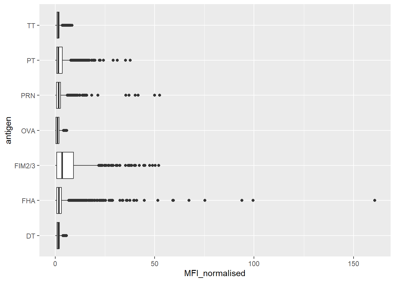
Q. Is there a difference for aP vs wP individuals with these values
ggplot(igg) +
  aes(MFI_normalised, antigen) +
geom_boxplot() +
facet_wrap(~infancy_vac)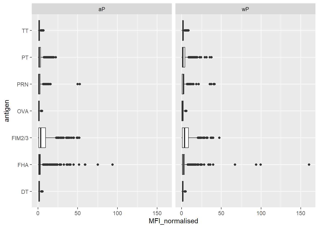
ggplot(igg) +
  aes(MFI_normalised, antigen, col=infancy_vac) +
  geom_boxplot()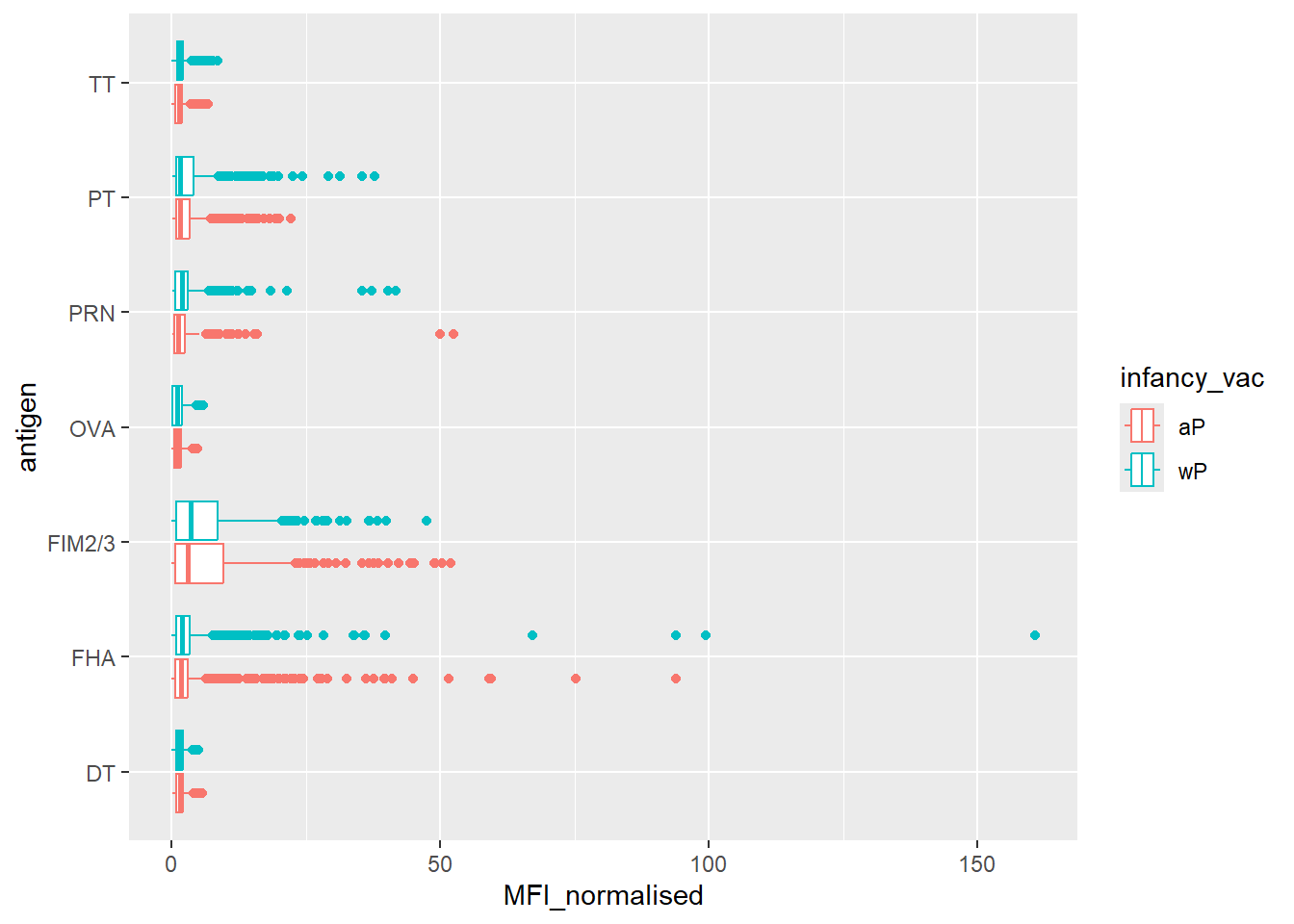
Q. Is there a temprol response - i.e. do values increase or decrease over time
ggplot(igg) +
  aes(MFI_normalised, antigen, col=infancy_vac) +
  geom_boxplot() +
  facet_wrap(~visit)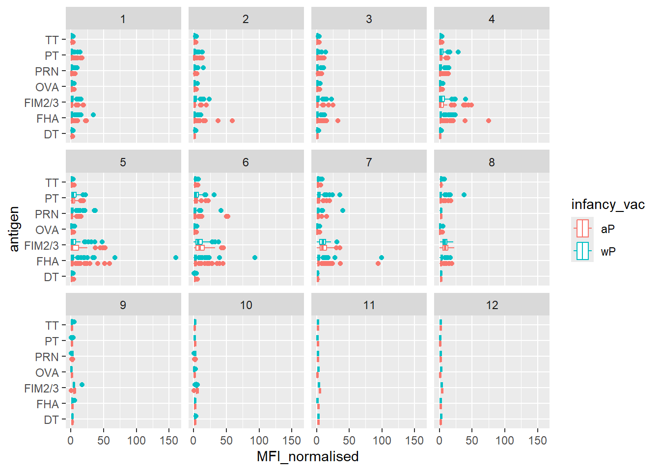
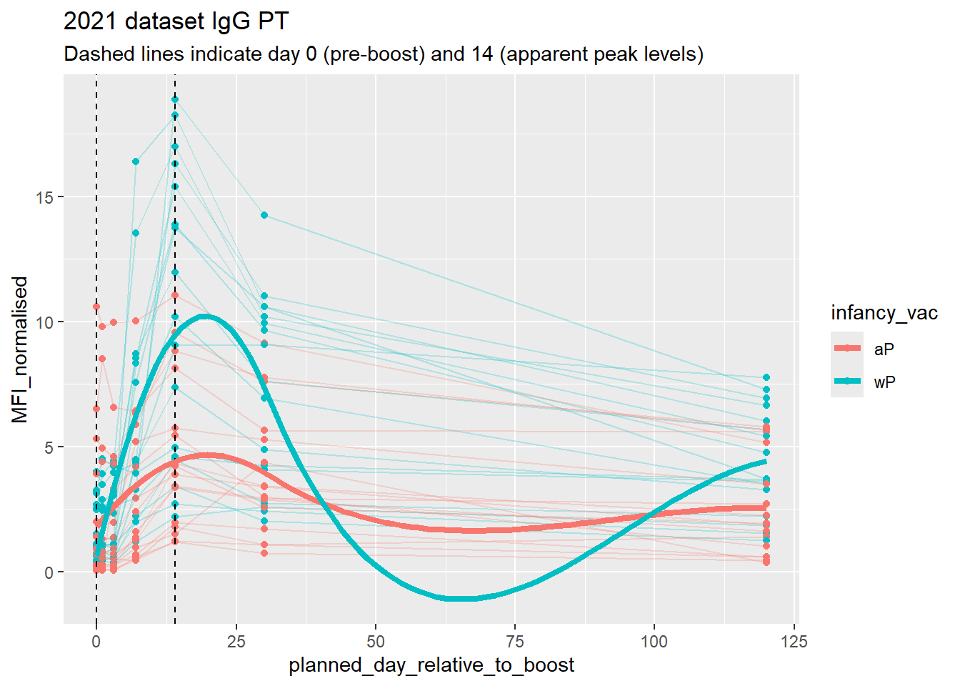
Focus on “PT” Pertussis Toxin antigen
pt.igg.21 <- igg |>
              filter(antigen == "PT",
dataset == "2021_dataset")ggplot(pt.igg.21) +
aes(planned_day_relative_to_boost,
MFI_normalised,
col=infancy_vac,
group = subject_id) +
geom_point() +
geom_line() +
geom_vline(xintercept = 14, col="black", lty=2) 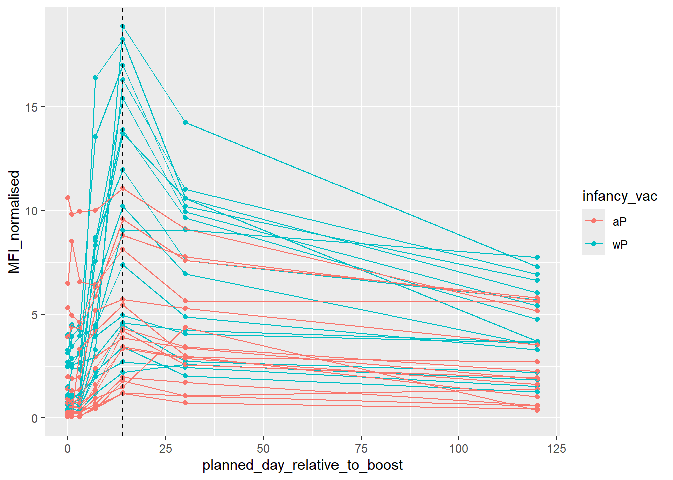
ggplot(pt.igg.21) +
  aes(planned_day_relative_to_boost,
      MFI_normalised,
      col=infancy_vac,
      group = subject_id) +
  geom_point() +
  geom_line(alpha=0.25) +
  geom_vline(xintercept = 14, col="black", lty=2) +
  geom_vline(xintercept = 0, lty=2) +
  geom_smooth(aes(group=infancy_vac), method="loess", span=1, se=FALSE, linewidth=1.5) +
  labs(title="2021 dataset IgG PT",
       subtitle = "Dashed lines indicate day 0 (pre-boost) and 14 (apparent peak levels)")
`geom_smooth()` using formula = 'y ~ x'